Saturday, October 31, 2009

Oslo’s Skyline Gets Three “Crystal Clear” Landmark Towers

Kristin Jarmund Architects in collaboration with C. F. Møller Architects, has recently won a major competition to design a spectacular new landmark project in the city of Oslo, for the client KLP Eiendom AS, one of Norway’s largest property investors. The project, which has been dubbed “Crystal Clear”, consists of three towers, which grow organically from the ground to form a sculptural cluster, and are composed of stacked, prismatic volumes.

Oslo Crystal Clear Towers

Click above image to enlarge
Competition-winning design for a new high-rise complex in the heart of Oslo

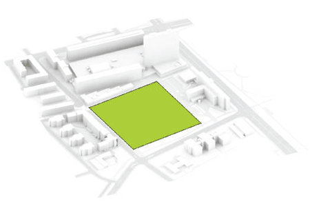
The development totals approx. 90,000 m² of offices, commercial space and possibly housing, located at one of Oslo’s most valuable sites, the former postal sorting office adjacent to the central station. ‘Crystal Clear’ ties in with the city’s skyline, and the string of developing landmark projects that will help turn Oslo into one of Europe’s most modern capitals.

Oslo Crystal Clear Towers

Click above image to enlarge
Rendering

Here’s some more info from the architects:

A high-rise development, located at Norway’s most important traffic hub in central Oslo, and with fantastic views of the waterfront and fjord-landscape beyond. The idea is to create a landmark sculptural ensemble of towers, yet observe the harmony with the surrounding, low-rise urban fabric of the capital. The three towers of approx. 110, 65 and 55 m height, are arranged along the edges of the site, and the tallest tower is aligned with the existing nearby Oslo Plaza and Postgirobygget towers, while the lower buildings form the link to the city.

Oslo Crystal Clear Towers

Click above image to enlarge
Rendering

Oslo Crystal Clear Towers

Click above image to enlarge
Rendering Interior

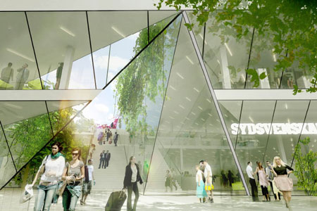
The three towers have clear-cut and vertical elevations to the exterior of the site, with large openings and setbacks forming windows to selected viewpoints. In contrast, the elevations towards the interior of the site are composed of stacked, glazed volumes, freely arranged to form a prismatic and crystalline appearance. The layout secures the views over the water, not only for the three new buildings but also the city beyond.

Oslo Crystal Clear Towers

Click above image to enlarge
Rendering Close-Up

Oslo Crystal Clear Towers

Click above image to enlarge
Rendering Close-Up

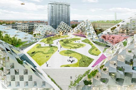
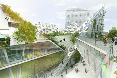
In between the towers, a two-story base containing shops and restaurants forms an undulating landscape that connects to street level via ramps, plateaus and stairs. This base creates a calm urban garden, framed by the tall buildings, with recreational space and cafes for the city and the buildings occupants. The towers are designed with a high degree of flexibility to house offices, hotels and possibly housing.

Oslo Crystal Clear Towers

Click above image to enlarge
Elevation

Oslo Crystal Clear Towers

Click above image to enlarge
Section

Oslo Crystal Clear Towers

Click above image to enlarge
Aerial photo of the site

Oslo Crystal Clear Towers

Click above image to enlarge
Site Plan

Oslo Crystal Clear Towers

Click above image to enlarge
Floor Plan

Oslo Crystal Clear Towers

Click above image to enlarge
Floor Plan

Oslo Crystal Clear Towers

Click above image to enlarge

Friday, October 30, 2009

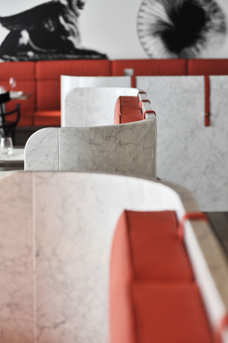
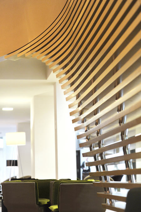
Sofitel Lyon Bellecour by Patrick Norguet


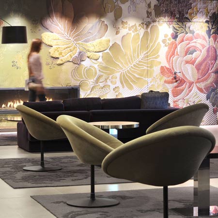
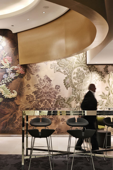
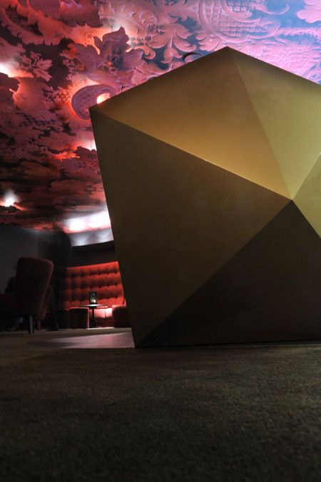
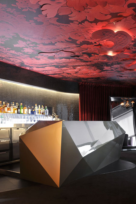
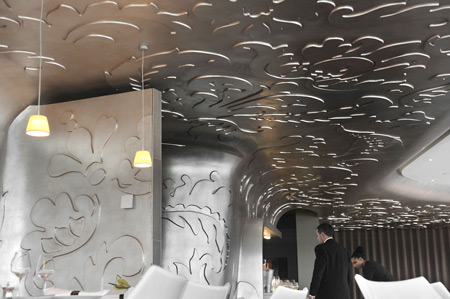
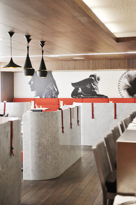
Paris designer Patrick Norguet has refurbished the interior of a hotel in Lyon, France, inspired by the history of silk production in the local area.

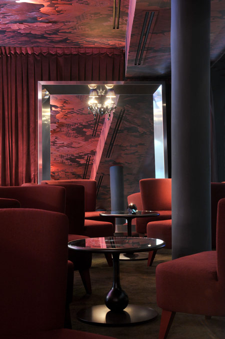
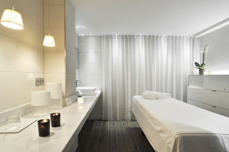
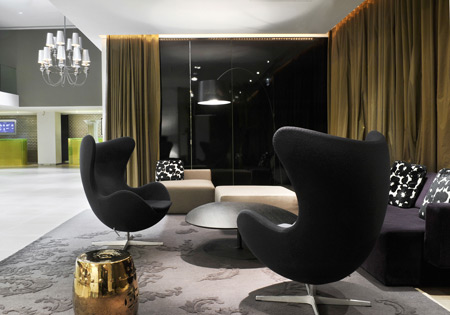
Designed for the Sofitel Lyon Bellecour, the project includes a spa, entrance hall, brasserie, restaurants and bars for the five-star hotel.

Photographs are by Renaud Callbaud.

Here’s some more information from Norguet:

From the recreational area to the haute cuisine, the Studio has redesigned Norguet new spaces for Sofitel Lyon Bellecour.

A major project or set of trades, on the history and creation come together.

Spa, lobby, lobby bar, brasserie “The Silk” restaurant “Les 3 Domes” and bar “Le Melhor” are areas designed to travel between culture, elegance and modernity.

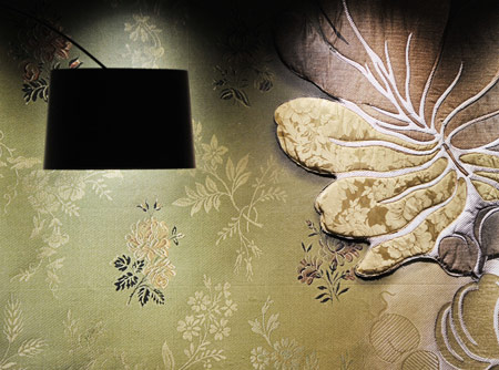
In reference to local heritage here combine the history of French silks revisited with the help of Tassinari & Chatel.

On the eighth floor, one of the finest tables of Lyon: the restaurant “Les 3 Domes” and bar “Le Melhor” offer a panoramic view of the Rhone.

After two years of work, the entire project will be completed soon.

Thursday, October 29, 2009

Hotel de Sers - Paris


Hôtel de Sers in Paris exemplifies a building that fits magnificently in its new role as a hotel because the current owners’ expensive and extensive renovation retained the initial feel and the structural bones of the original mansion, and managed to insert today’s touches in a way that does not feel like a pretentious afterthought.


Today, Hôtel de Sers has 45 rooms, four junior suites, two large suites with terraces that overlook all of the splendor of Paris, and one 80-square-meter apartment. The original building was a four-storey mansion designed by architect Jules Pellechet in 1880 for Henri-Leopold Charles, the Marquis de Sers.


In the early 1900s, the building served as a medical facility and gained four more floors and a six-storey attachment. It has been a hotel since 1935. In 1999, the Vidalenc family took over the building that was then known as Hôtel le Queen Elizabeth, and the family's younger son, Thibault Vidalenc, became the general manager. He engaged his cousin, recently graduated architect Thomas Vidalenc, and together the two began the 11 million Euro transformation of the old mansion into the chic and desirable Hôtel de Sers it is today.


Thomas Vidalenc designed most of the furniture as well, and added the latest comforts, technology and amenities to the rooms, but the new never overpowers the French classical elements.

The designer touches -- such as modern, sculptural occasional tables, and chairs and cushions covered in retro-floral fabrics -- add a Scandinavian, modernist feel, but it all seems to somehow belong in this environment that is resplendent with gold, and old paintings and red velvet. Not an easy balance to achieve.

Wednesday, October 28, 2009

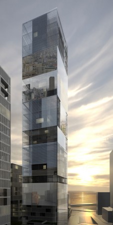
Mirror Tower / LAN Architecture


lan04

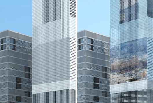
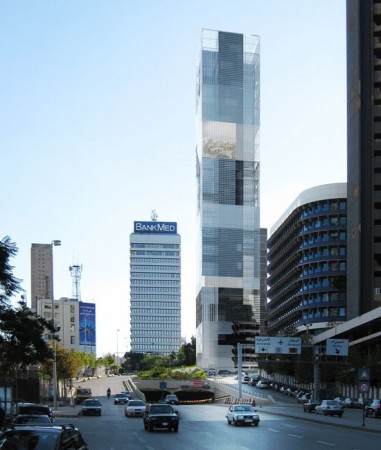
LAN Architecture’s Mirror Tower contains more than 30,000 identical facets that reflect 14 of the city’s monuments and are orientated to produce smooth transitions between these panoramic viewpoints. “The starting point of the project was to imagine Beirut in all its complexity. We have imagined the city as an ‘un-finished’ superposition of histories, contexts, architectures and situations; Our project was conceived as an interface, an algorithm that generates new connections and that creates new view axis, ways of observing the history, the present and the future,” explained LAN architects. The building’s complex envelope reflects changes in surroundings, the seasons and light. The reflective façade works by globally defining the orientation of each facet of the cylinder’s surface to create the desired reflection. With the help of specialists, LAN Architecture produced an automated 3D tool that allowed the team to visualize different instances of the facade by changing viewpoints at will, both the reflective area and the position of the reflected images on the tower.

More about the tower and more images after the break.

lan03

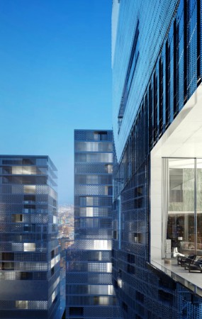
Structured along a cross-shaped volume, the building’s envelope is a solar protection based on a square plan of 25×25m. The outer envelope consists of sliding panels made of perforated sheet metal with mirror polish finishing. It reflects, protects and lets views and light pass all at the same time. The terraces of the apartments occupy at one floor out of four the voids in the angles of the cross plan. “The tower becomes phantom, shows or doesn’t shows its faces, it will be understood in different ways depending on the light shining on it, the angle from which it’s perceived. The rest is architecture.”
lan02

Cluster Houses are the residential piece of the project, and arguably the most important program unit. “We wanted to realize a continuity of typology as to the traditional oriental patio house, with its rich relation between interior and exterior, and this in a vertical type of building,” explained the architects. The apartments are entered through an exterior space, and the day living and dining areas are again separated by a patio. Particular attention has been paid to such indoor-outdoor sequences, permitting the apartment to morph from winter to summer by a double skin. The houses’ materiality intend to continue the contextual and typological concept of the city.
lan01

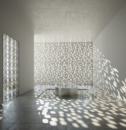
The exterior skin is clad in Ductal which becomes completely open at times, or perforated by different patterns, permitting light to cross and draw beautiful shadows. The structural mineral envelope is separated by a corridor in perimeter of the apartment of the inner glazed façade.

lan10

Since the tower is located in an urban area dominated by high-rise buildings, public roof gardens add greenery to the site. Such levels are vertically connected by voids and skylights incorporated in the green strips and passageways, permitting light and views to cross.

lan06

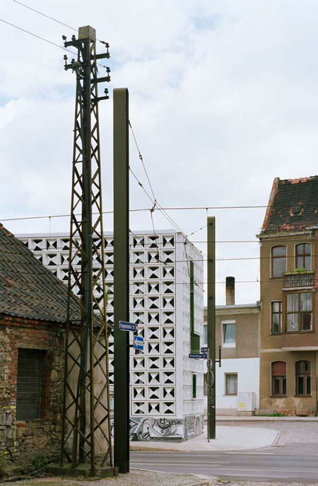
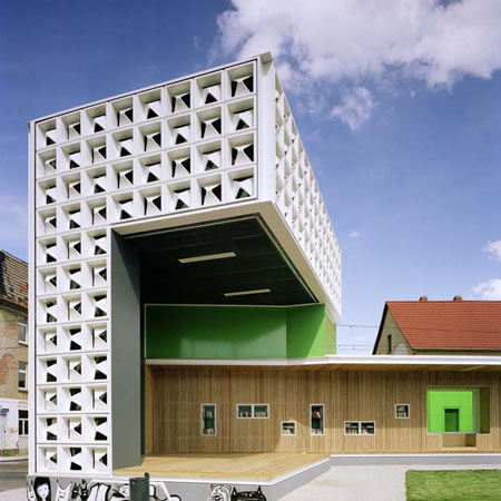
Open-air Library by KARO


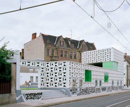
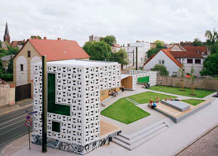
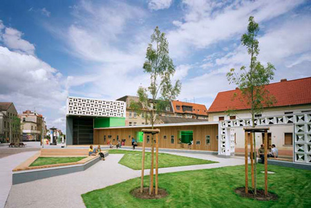
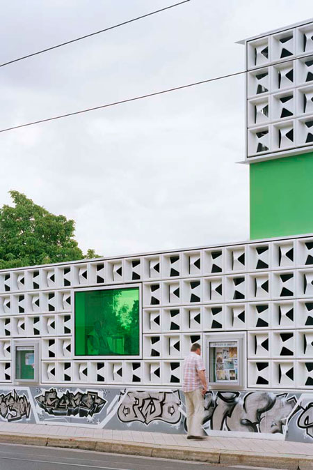
German designers KARO have designed an outdoor library in Magdeburg, Germany.

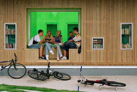
Developed from an installation in 2005 made of beer crates, the new building comprises sheltered seating areas and niches to store books.

The new building is clad in wood and materials from a former warehouse.

Photographs are by Anja Schlamann.

Here’s some text from KARO:

We established in 2005 in an abandoned district center in East Germany. We started with a public intervention, using beercrates as building material.

It took some some years to organise the money to build this so called “bookmark” for real. It opened in June this year.

Beside the social aspects, the architectural kick is, that we re-used the facade of an old warehouse.

Last year, in its project-phase, it has been shown at the Venice Biennale in the German pavillon (updating Germany). An installation of it has also been shown in 2006 in the exhibition “Talking Cities” curated by Francesca Fergueson.

KARO is a platform for communication, architecture and space organisation, the members work as architects, artists, critics and jounalists, as well as teachers.

The World Village of Women Sports by BIG


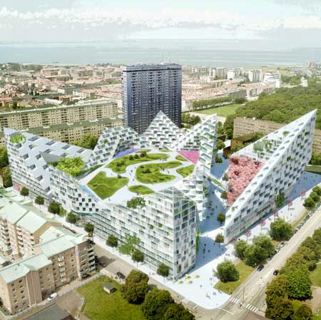
Danish architects BIG have won a competition to design a centre for research, education and training about women’s sports in Malmo, Sweden.

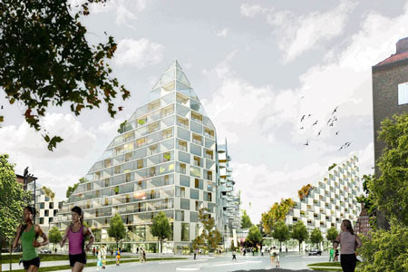
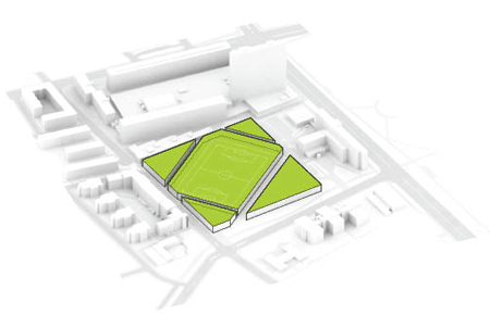
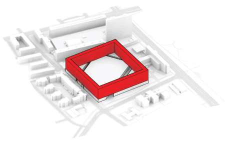
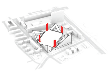
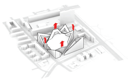
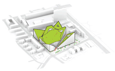
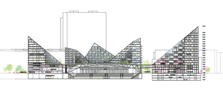
Called The World Village of Women Sports, the project is conceived as a series of buildings of varying size with sloping roofs, alternating with open spaces.

The main hall will be able to accommodate football matches, concerts, conferences, exhibitions and markets.

Here’s some more information from BIG:

BIG wins competition for The World Village of Women Sports

BIG, in collaboration with AKT, Tyréns and Transsolar are awarded first place in a design competition in Malmo, Sweden for a 100.000m2 first of its kind sports facility.

dzn_The World Village of Women Sports by BIG 16

The World Village of Women Sports seeks to create a natural gathering place for the research, education and training in all areas connected to the development of women’s sports.

Located in the centre of Malmo, the 100.000 m2 facility will create a regional landmark and new attraction for the area.

The winning design was chosen among five submissions by a jury, comprised of the founder and main financier of the World Village of Women Sports, Kent Widding Persson, the co-founder and entrepreneur Maarten Hedlund, City of Malmo Architect,Ingemar Graahamn and Architects Mats Jacobson and Cecilia Hansson together with representatives from the City of Malmo.

“BIGs design places great emphasis on architecture tailored to women with an unconstrained atmosphere and a feeling of well-being. The architects see the WVOWS as a town within a town rather than just a sports complex. The decisive factor has been the holistic approach and the overall impression of the design – the ability to interact with the neighborhood and environment, and creating attractive housing and functions at the same time.” Mats Jacobson, Jury Member, WVOWS

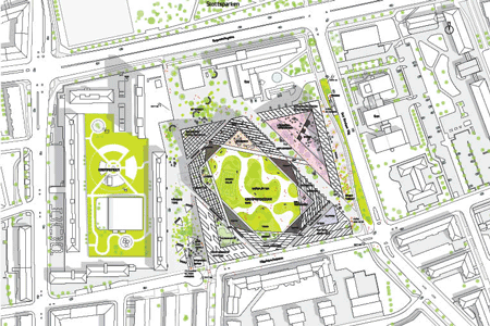
Composed as a village rather than a sports complex the WVOWS combines individual buildings with a variety of uses with open spaces and public gardens.

The sloping roofscapes and alternating building volumes provide the complex with the varying identity of a small village thus reducing its scale to the adjacent neighborhood.

The interior streets animated through public functions resemble a medieval downtown, supporting all aspects of human life – generous living, work and intensive play.

“Considering the special requirements of women of all cultures and all ages, special attention has been given, to provide the sports village with a feeling of intimacy and well being often lacking in the more masculine industrial-style sports complexes that are more like factories for physical exercise, than temples for body and mind.” Bjarke Ingels, Partner-In-Charge, BIG

The central hall is large enough to accommodate professional football matches as well as concerts, conferences, exhibitions and flea markets. Rather than being an introverted sports arena shut off from the surrounding city – it appears like an open and welcoming public space, visible from all of the surrounding streets – generously offering its interior life to the passers-by. The pedestrian network around the main sports hall plugs into the surrounding street networks as well as the interior galleries of Kronprinsen, turning it into a complete ecosystem of urban life.

“The WVOWS fuses high levels of ambition within public space and private accommodation, living and working, health and recreation, sport and culture. Like a village rather than sports complex it merges the modern utopianism of the neighboring Kronprinsen with the intimate scale and specificity of the nearby historical city center of Malmo.” Bjarke Ingels, Partner-In-Charge, BIG

“From the main football field at its heart, to the gyms and auditoria, from the handball halls of the university to the laboratories of the health facility, it is an entire village committed to sport.” Nanna Gyldholm Moller, Project Leader, BIG

WORLD VILLAGE OF WOMEN SPORTS CREDIT LIST:

PROJECT: WVOWS
TYPE: Invited Competition
CLIENT: H-Hagen Fastighets AB
COLLABORATORS: AKT, Tyréns, Transsolar
SIZE: 100.000 M2
LOCATION: Malmo, Sweden
STATUS: 1st Prize

Blog Archive