Thursday, October 28, 2010

Caixa Forum


Nicole Jewel from Interior Design Training is our honorary guest writer on CoolBoom.net, who is going to share with us some extraordinary protects, starting with the Caixa Forum in Madrid.
caixa-forum1
Madrid is an easy city to love. It’s got a great climate, active nightlife, fantastic cuisine and rich history. But I always feel as if it is missing a little something. What would that be? The striking beauty of other European capitals.
I don’t mean that Madrid is ugly. It’s got more than its fair share of old world charm and yes, it certainly meets the qualifications of a great European city. Ornate fountains? Check. Magnificent cathedrals? Check. Majestic palaces? Check. However in comparison to other European capitals, Madrid is a little lacking in the classic beauty department. It just doesn’t have that romantic glow of Paris, the sexy pulse of Rome, or the shiny vitality of Berlin.
But Madrid does have is its own unique, artistic style; an understated type of polish and refinement that makes it an enchanting city. Yes, Madrid has its visitor landmarks which you should definitely see. But the secret behind the city is that Madrid is filled with hidden treasures of beautiful plazas, gardens, and architectural gems. You just have to know where to look.
One such hidden jewel is the Caixa Forum along Madrid’s Paseo del Prado. Heavily overshadowed by its famous neighbors in the Golden Triangle of Madrid’s world renowned Prado and Thyssen- Bournemisza museums, the Caixa Forum is on a nondescript little corner that is easily missed.
At one time a power station in the late 19th century, the Herzog & de Meuron architecture studio began a seven-year renovation of the building in 2001. The Caixa Forum opened in 2007, having been completely transformed. The industrial exterior was restored entirely by hand and is almost completely original, aside from the concrete base that surrounded the previous building.
After taking in the beauty of its angular, rusted steel façade, you might notice that the building appears to be hovering. Yes, it floats above ground gently daring visitors to enter its dark and sinister underbelly. And of course, just to further confound the senses, this enigma of a building is settled adjacent to one of Patrick Blanc’s living walls. It’s really an attractive display of contrasting designs between modern rehabilitation and natural growth.
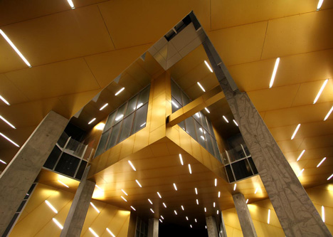
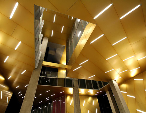
With seven floors and over 8,000 square feet of exhibition space, the Caixa Forum was designed to be a “live space”. In stark contrast to its outward appearance, the building’s interior is modern and glossy. The first floor features dramatic neon lighting, creating the impression of a futuristic cinema house. Different levels are connected by a brilliant white staircase, leading to large, spacious rooms that house a variety of classic, modern, and contemporary art. The space also offers a multimedia library, and an auditorium for concerts, poetry festivals, and educational workshops.
caixa-forum2
caixa-forum3
caixa-forum5

Wednesday, October 27, 2010

8-house-by-big-2

8 House by BIG
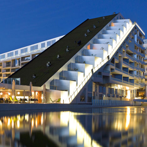
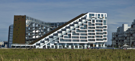
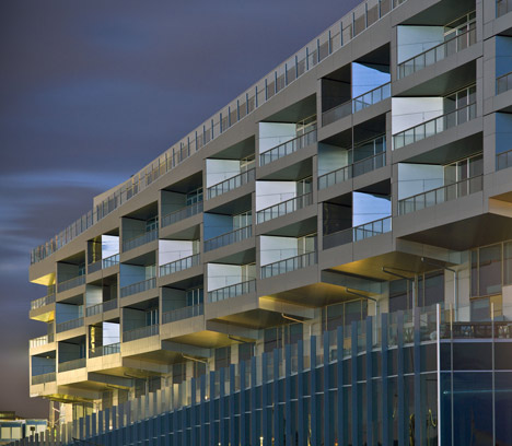
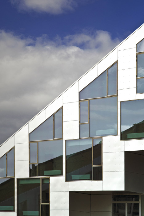
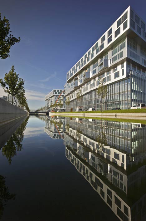
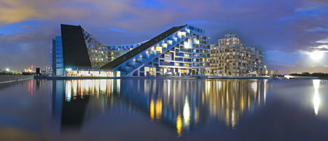
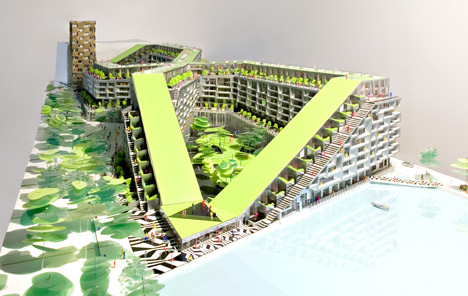
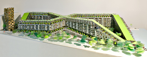
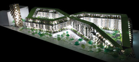
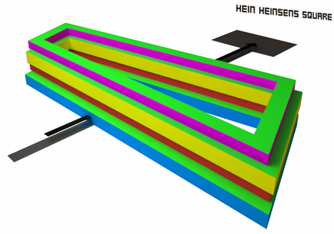
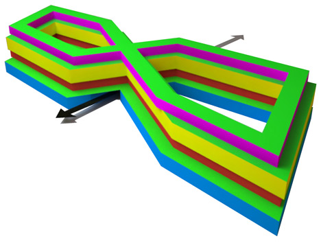
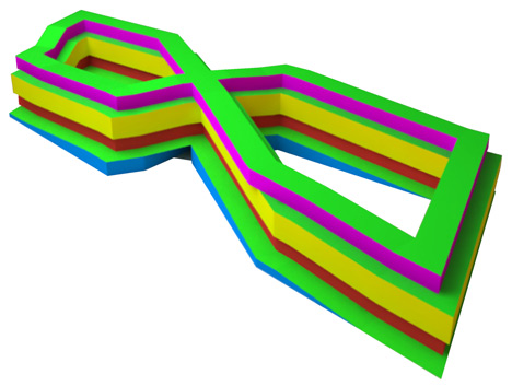
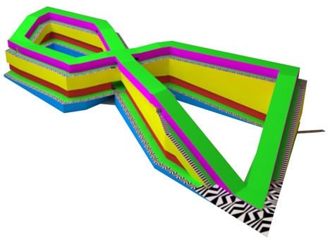
Danish architects BIG have completed their 8 House residential project with a figure-of-eight plan in Copenhagen.
8 House by Big
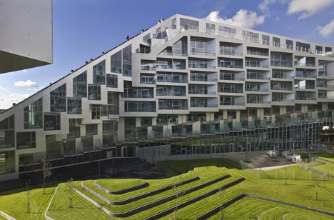
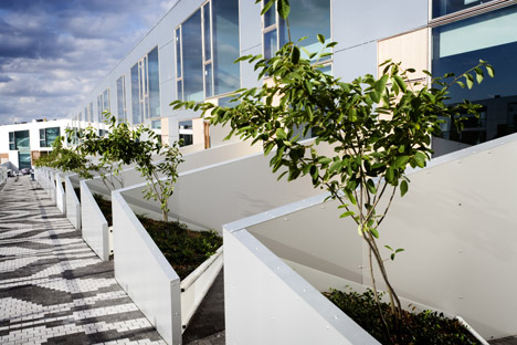
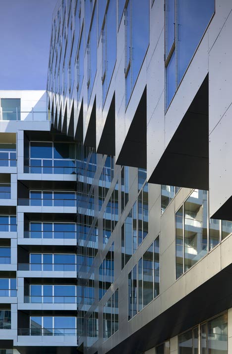
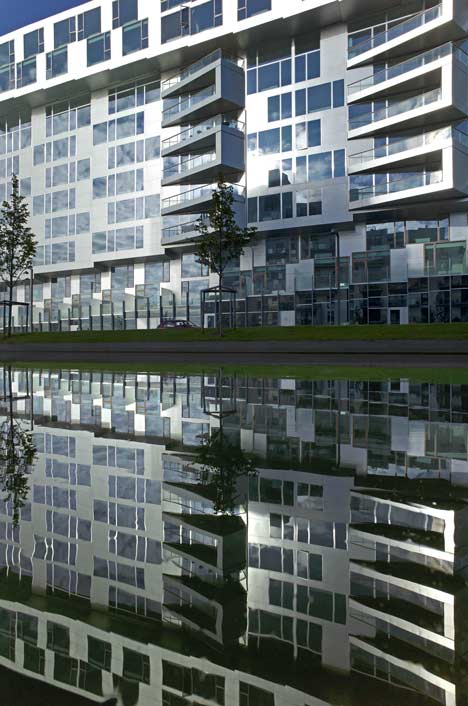
The building features a continuous cycle path and pedestrian walkway, winding up to the tenth floor and back down to ground level, and providing access to all residences.
8 House by BIG
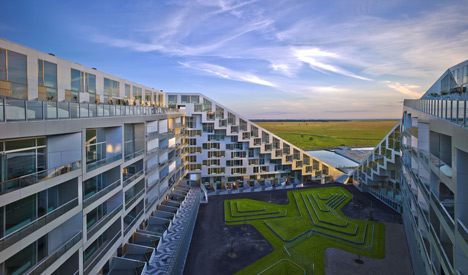
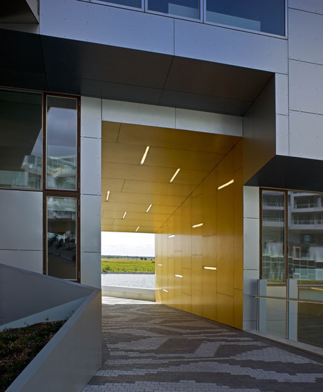
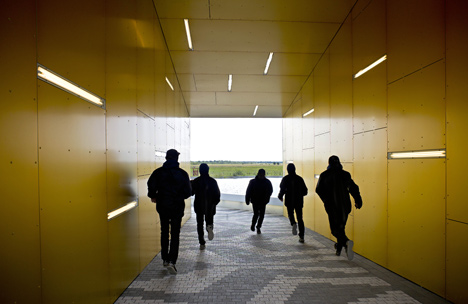
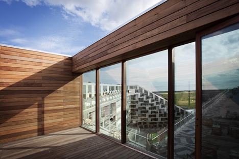
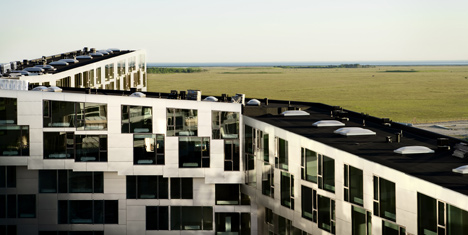
The structure wraps around two courtyards connected by a tunnel through the central cross, which houses communal facilities.
8 House by BIG
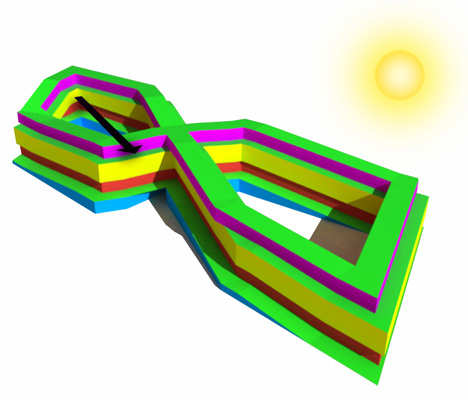
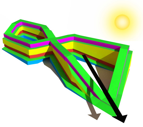
Its height is lower on the south-west corner and higher at the north-east side to make best use of daylight.
8 House by BIG
See our earlier story about the project’s green roofs here.
8 House by BIG
8 House by BIG
Photographs are by Jens Lind unless stated otherwise.
8 House by BIG
The text that follows is from the architects:

BIG COMPLETES ITS TRILOGY OF HOUSING WITH THE 8 HOUSE IN COPENHAGEN
Celebrating its third project with the same development team in the maturing neighborhood of Orestad, the construction of the 61,000 m2 8 House has come to an end, allowing people to bike all the way from the street up to its 10th level penthouses alongside terraced gardens where the first residents have already moved in.
8 House by BIG
Above photograph is by Ty Stange
The bowtie-shaped 61,000 m2 mixed-use building of three different types of residential housing and 10,000 m2 of retail and offices comprises Denmark’s largest private development ever undertaken.
8 House by BIG
Above photograph is by Ty Stange
Commissioned by St. Frederikslund and Per Hopfner in 2006, the 8 House sits on the outer edge of the city as the southern most outpost of Orestad.
8 House by BIG
Above photograph is by Ty Stange
Rather than a traditional block, the 8 House stacks all ingredients of a lively urban neighborhood into horizontal layers of typologies connected by a continuous promenade and cycling path up to the 10th floor creating a three-dimensional urban neighborhood where suburban life merges with the energy of a big city, where business and housing co-exist.
8 House by BIG
Above photograph is by Ty Stange
“We have now completed three remarkable buildings in Orestad, the VM Houses, The Mountain and finally the 8 House – which is the sole result of a good and constructive collaboration with talented young architects who had a good understanding for the economical aspects,” Per Hopfner, Hopfner Partners
8 House by BIG
Above photograph is by Ty Stange
The 8 House creates two intimate interior courtyards, separated by the centre of the cross which houses 500 m2 of communal facilities available for all residents.
8 House by BIG
Above photograph is by Ty Stange
At the very same spot, the building is penetrated by a 9 meter wide passage that allows people to easily move from the park area on its western edge to the water filled canals to the east. Instead of dividing the different functions of the building – for both habitation and trade – into separate blocks, the various functions have been spread out horizontally.
8 House by BIG
Above photograph is by Ty Stange
“The apartments are placed at the top while the commercial programme unfolds at the base of the building.
8 House by BIG
Above photograph is by Ty Stange
As a result, the different horizontal layers have achieved a quality of their own: the apartments benefit from the view, sunlight and fresh air, while the office leases merge with life on the street.
8 House by BIG
This is emphasized by the shape of 8 House which is literally hoisted up in the Northeast corner and pushed down at the Southwest corner, allowing light and air to enter the southern courtyard,” Thomas Christoffersen, Partner in Charge, 8 House, BIG
8 House by BIG
A continuous public path stretches from street level to the penthouses and allows people to bike all the way from the ground floor to the top, moving alongside townhouses with gardens, winding through an urban perimeter block.
8 House by BIG
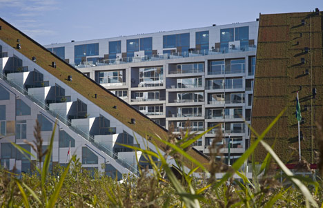
Two sloping green roofs totaling 1,700 m2 are strategically placed to reduce the urban heat island effect as well as providing the visual identity to the project and tying it back to the adjacent farmlands towards the south.
8 House by Big
“8 House is a three-dimensional neighborhood rather than an architectural object.
8 House by BIG
An alley of 150 rowhouses stretches through the entire block and twists all the way from street level to the top and down again.
8 House by Big
Where social life, the spontaneous encounter and neighbor interaction traditionally is restricted to the ground level, the 8 House allows it to expand all the way to the top,” Bjarke Ingels, Founding Partner, BIG
8 House by Big
The 8 House uses size to its advantage by creating immense differences in height thereby creating a unique sense of community with small gardens and pathways that remind you of the intimacy of an Italian hill town.
8 House by BIG
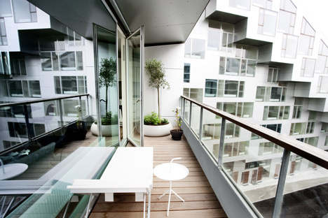
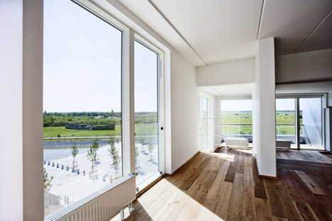
With spectacular views towards the Copenhagen Canal and Kalvebod Faelled’s protected open spaces, 8 House provides residences to people in all of life’s stages through its 476 housing units, including apartments of varied sizes, penthouses and townhouses as well as office spaces to the city’s business and trade in one single building.
8 House by Big
“8 House is our second realized example of architectural alchemy – the idea that by mixing traditional ingredients, retail, row- houses and apartments in untraditional ways – you create added value if not gold.
8 House by Big
The mix allows the individual activities to find their way to the most ideal location within the common framework – the retail facing street, the offices towards northern light and the residences with sun and views to the open spaces.
8 House by Big
8 House is a perimeter block that morphs into a knot, twisting and turning to maximize the life quality of its many inhabitants,” Bjarke Ingels, Founding Partner, BIG
8 House by Big
8 House by Big
8 House by Big
8 House by Big
8 House by Big
8 House by Big
PROJECT 8 HOUSE
CLIENT ST. FREDERIKSLUND HOLDING
ARCHITECT BIG-BJARKE INGELS GROUP
COLLABORATION HOPFNER PARTNERS, MOE & BRODSGAARD, KLAR
SIZE 61,000 M2, 476 RESIDENCES
COST EUR 92,000,000
LOCATION COPENHAGEN, DK
STATUS COMPLETED 2010
Partner-In-Charge: Bjarke Ingels, Thomas Christoffersen Project Leader: Ole Elkjaer-Larsen, Henrick Poulsen Project Manager: Finn Norkjaer, Henrik Lund
Team: Dennis Rasmussen, Rune Hansen, Agustin Perez Torres, Annette Jensen, Carolien Schippers, Caroline Vogelius Wiener, Claus Tversted, David Duffus, Hans Larsen, Jan Magasanik, Anders Nissen, Christian Alvarez Gomez, Hjalti Gestsson, Johan Cool, James Duggan Schrader, Jakob Lange, Kirstine Ragnhild, Jakob Monefeldt, Jeppe Marling Kiib, Joost Van Nes, Kasia Brzusnian, Kasper Broendum Larsen, Louise Heboell, Maria Sole Bravo, Ole Nannberg, Pablo Labra, Pernille Uglvig Jessen, Peter Rieff, Peter Voigt Albertsen, Peter Larsson, Rasmus Kragh Bjerregaard, Richard Howis, Soeren Lambertsen, Eduardo Perez, Ondrej Tichy, Sara Sosio, Karsten Hammer Hansen, Christer Nesvik, Soeren Peter Kristensen, Lacin Karaoz, Marcello Cova, Luis Felipe González Delgado, Janghee Yoo, SunMing Lee

Wednesday, October 20, 2010

D’espresso by Nemaworkshop

D'espresso by Nemaworkshop
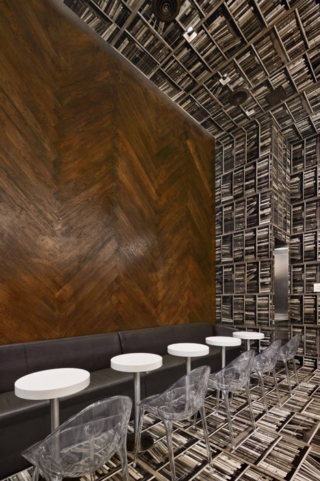
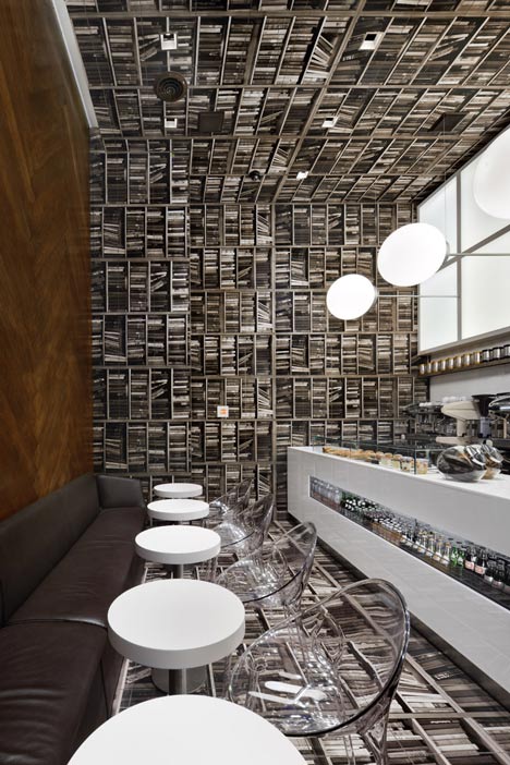
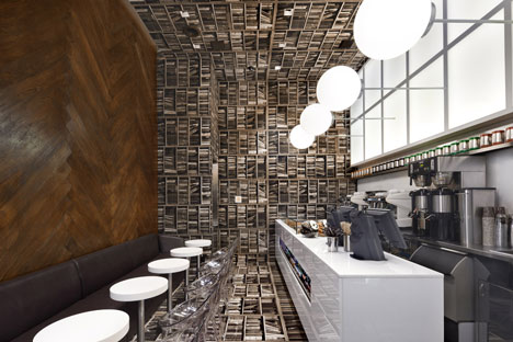
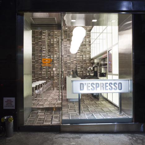
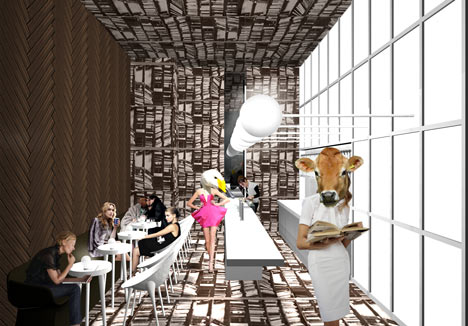
This espresso bar to be located near Grand Central Station in New York was designed by New York studio Nemaworkshop to resemble a library turned on its side.
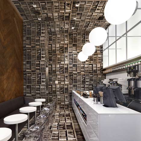
D'espresso by Nemaworkshop
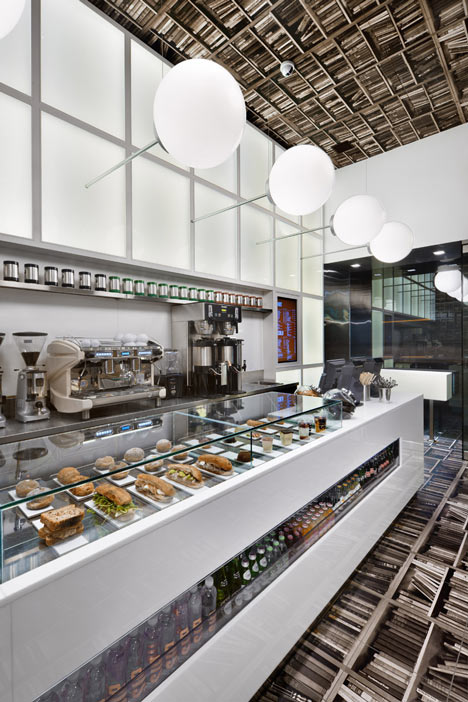
Called D’espresso, the interior has been rotated 90 degrees so that one wall features herringbone-pattern wooden flooring while the opposite wall will have pendent lights protruding horizontally.
D'espresso by Nemaworkshop
A photograph of bookshelves printed on custom tiles will line the floor, end wall and ceiling.
D'espresso by Nemaworkshop
Images are by David Joseph.
The information below is from Nemaworkshop:

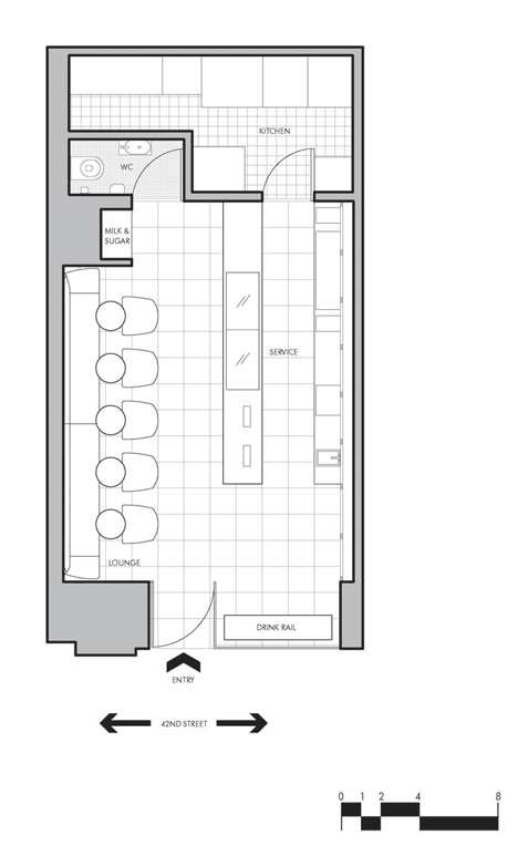
Located on Madison Avenue, the espresso bar conceptually and literally turns a normal room sideways, creating a striking identity for the emerging brand.
D'espresso by Nemaworkshop
The client approached nemaworkshop with an ambition to build a unique espresso brand and to develop a creative environment that connects to its location on Madison Avenue near Grand Central Station. Inspired by the nearby Bryant Park Library, nemaworkshop designed a store that is straightforward in a simple twisted way – Take a library and turn it SIDEWAYS.
D'espresso by Nemaworkshop
The book-lined shelves become the floor and ceilings and wood floor ends up on the walls meanwhile the pendants protrude sideways from the wall. To achieve the books shelves on the floor, the space is lined with sepia-toned full size photograph of books printed on custom tiles.
D'espresso by Nemaworkshop
The custom tiles run along the floor, up the 15’ foot wall and across the ceiling. The frosted glass wall behind the service counter illuminates the space and the wall directly opposite is clad in dark brown herringbone. The thrust of this concept finds expression in the lighting and materiality, and ultimately the space gives definition to the emerging brand. The concept itself is bold and receptive to future locations.
D'espresso by Nemaworkshop

Friday, October 15, 2010

sperone-westwater-new-york

Sperone Westwater, New York

Manhattan gallery's centrepiece is a unique moving room...
Sperone Westwater, New York
October 14th, 2010
Connecting the upper 4 floors of the Sperone Westwater gallery on Manhattan’s Bowery is a beguiling, bright red 12 by 20 foot moving room, part gallery – part elevator. The centrepiece of Foster + Partners‘ elegant micro-skyscraper, elegantly wedged between the existing buildings of this busy street, is completely visible from the exterior – offering an utterly unique façade, its leisurely speed offering stark contrast to the traffic below. The gallery itself is light, airy and belying its compact proportions, especially in the imposing street-level double height, 27-foot high space. Opening with an exhibition of paintings by Argentinean artist, Guillermo Kuitca – that runs until 6th November – this new space looks set to heighten the Bowery’s credentials as Manhattan’s next art hotspot, whilst becoming an architectural icon all of its own…
Sperone Westwater, New YorkSperone Westwater, New YorkSperone Westwater, New YorkSperone Westwater, New YorkSperone Westwater, New YorkSperone Westwater, New York


Sperone Westwater, New York

Wednesday, October 13, 2010

Choisy-le-Roi Bridge


Choisy-le-Roi Bridge

Choisy-le-Roi-Bridge1
Jacques Ferrier Architects designed the new Choisy-le-Roi bridge that crosses the express railway lines and connects the port district to the town center.
The 70 meter long bridge has a traffic lane in each direction contained within wide footpaths to either side. Connecting the recently rehabilitated port district with its housing, amenities, offices and imprimerie nationale workshops as well as avenue anatole france to the town centre, the bridge is an essential element in guaranteeing the success of this new district which, until now, has been cut off from the city due to its location between the railway lines and the river seine.
Choisy-le-Roi-Bridge2
Choisy-le-Roi-Bridge3
Choisy-le-Roi-Bridge4

sugamo-shinkin-bank-tokyo

Sugamo Shinkin Bank, Tokyo

encouraging 'happy' banking through refreshing light and colour...
Sugamo Shinkin Bank, Tokyo
October 7th, 2010
Ask for a colour associated with banking, and 9 out of 10 will probably come back with ‘grey’ – it’s just one of those industries that tend to offer little in the way of inspiration, which makes emmanuelle moureaux architecture + design’s wonderfully vivid design for Tokyo’s Sugamo Shinkin Bank all the more worthy of attention. The blisteringly white structure is randomly dotted with large and small windows that are cut into the façade, with beautiful, fresh colours inside the cutaways… the colour palette is continued within, this time in the form of a leaf motif that continues through the interiors. Fresh, original, and capable of putting a smile on the glummest of customers faces… shouldn’t all banking be like this?
Sugamo Shinkin Bank, TokyoSugamo Shinkin Bank, TokyoSugamo Shinkin Bank, TokyoSugamo Shinkin Bank, TokyoSugamo Shinkin Bank, TokyoSugamo Shinkin Bank, TokyoSugamo Shinkin Bank, TokyoSugamo Shinkin Bank, TokyoSugamo Shinkin Bank, TokyoSugamo Shinkin Bank, TokyoSugamo Shinkin Bank, TokyoSugamo Shinkin Bank, Tokyo

Blog Archive