Sunday, February 28, 2010

Dunhill - NY Fashion Week


We are seeing more and more stores and services dedicated solely to the fine things in life for men. Salons, shops and spas are realizing that men have been treated like second-class citizens when it comes to luxurious, beautiful retail environments.

There are millions of sports bars, car dealerships, gyms and hardware stores, but that is definitely not all that men need and want. At New York Fashion Week, British luxury men’s brand Alfred Dunhill showcased its Winter 2010 collection in a vacant Meatpacking District warehouse transformed into a pop-up shop.

With aluminum panels and projection technology, London-based design workshop Campaign created an environment that brought a little bit of Dunhill’s London flagship store to New York.
Alfred Dunhill, who joined his father’s saddlery business in 1887, and planned to change the company’s focus toward the pioneering motorist, said it very well: “It is not enough to expect a man to pay for the best, you must also give him what he has paid for...” We think men are ready to pay for the best -- and “the best” includes the environment in which he spends his money. - Tuija Seipell

Saturday, February 27, 2010

MM Apartment by Nakae Architects and Ohno Japan


Japanese architects Nakae Architects and Ohno Japan have collaborated to create student accommodation in Tokyo where slits run round the building near the top of each storey.
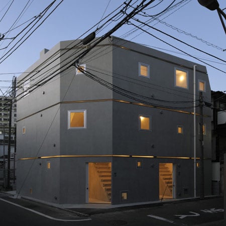
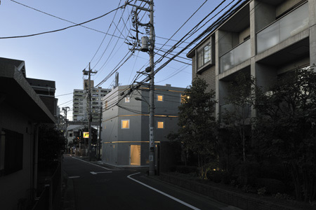
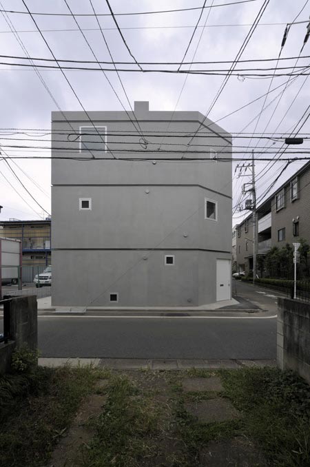
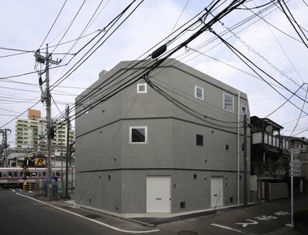
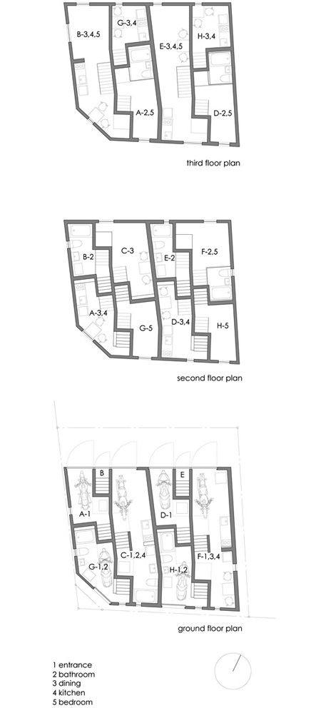
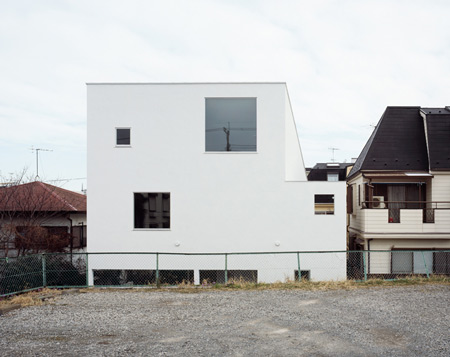
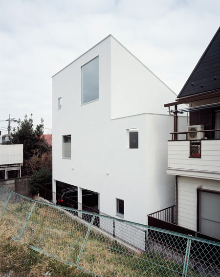
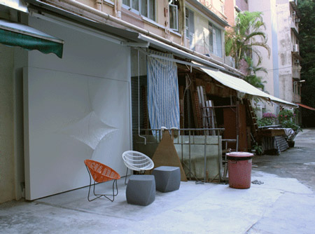
Called MM Apartment, the three-storey residence is divided into eight dwellings, each designed for a single person.
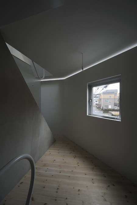
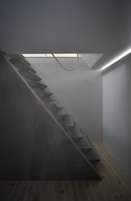
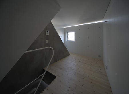
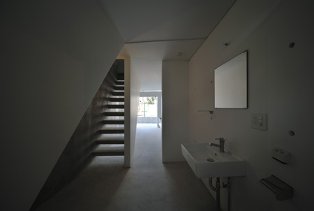
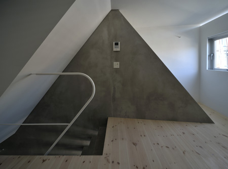
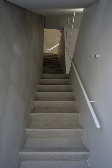
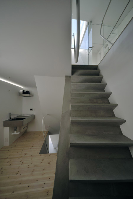
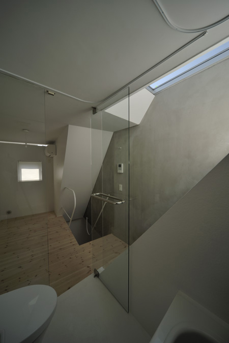
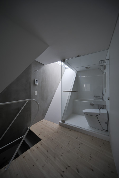
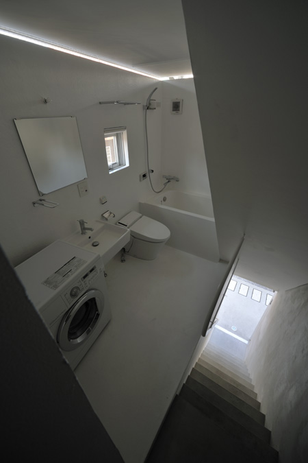
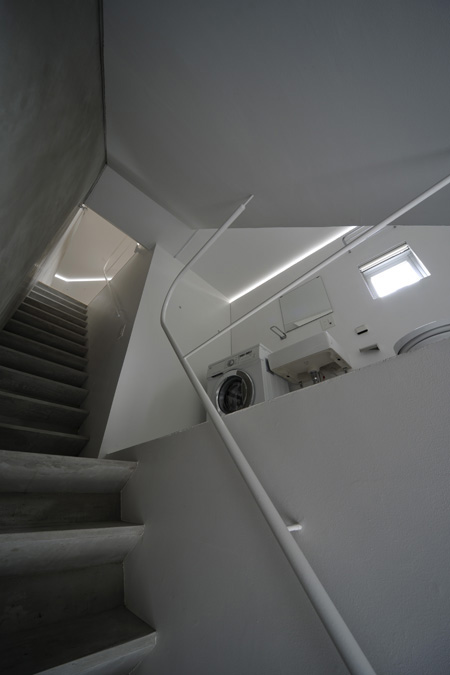
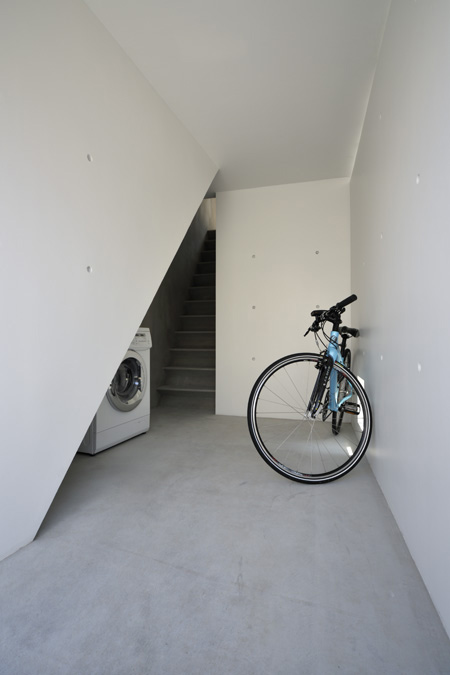
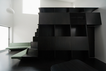
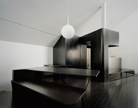
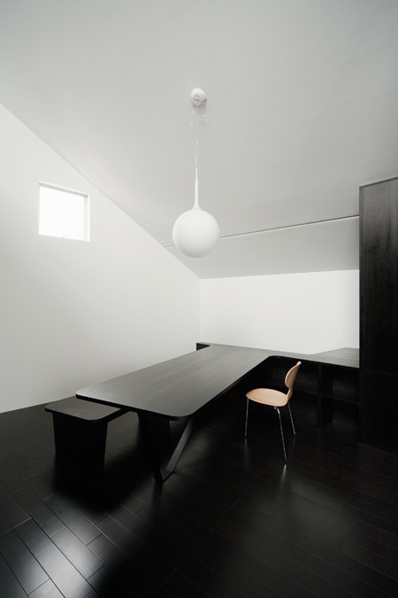
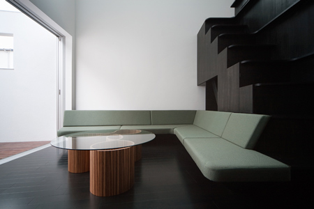
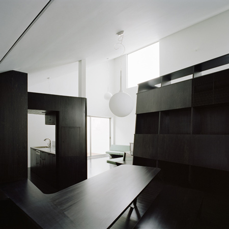
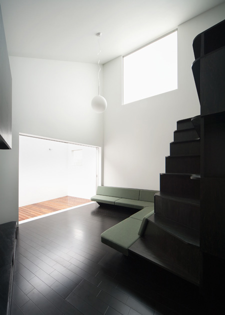
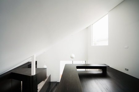
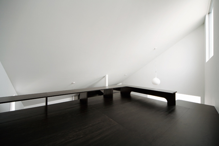
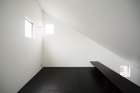
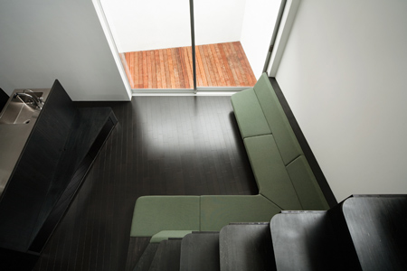
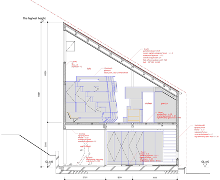
Each apartment spans two floors and the multiple flights of stairs create angled walls within adjacent rooms.
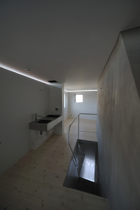
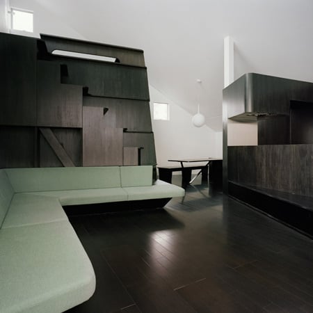
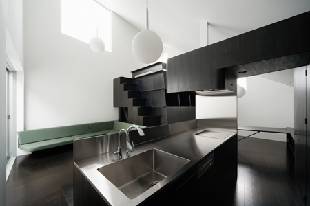
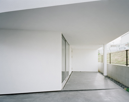
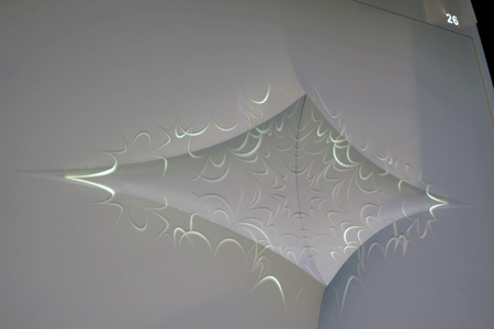
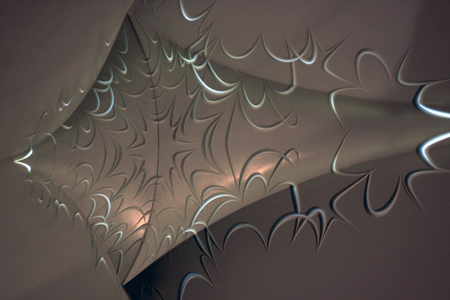
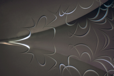
The slits near the top of each storey admit slices of light so that each storey seems to float above the one below.
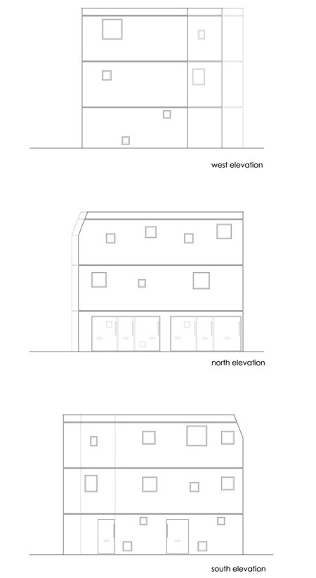
Small square windows are positioned at different heights in the facade.
Photographs are by Hiroyasu Sakaguchi.
Here’s some more information from the architect:

MM APARTMENT
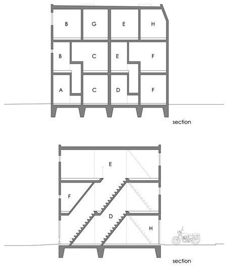
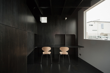
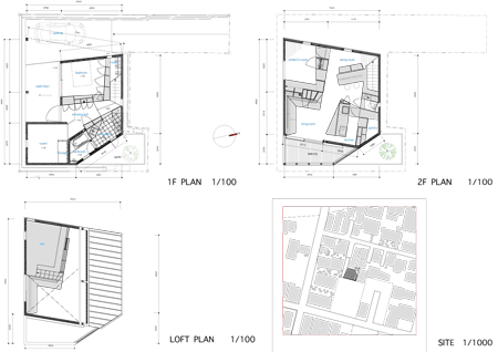
A three-story multiple dwelling house, consisting of eight housing units for a single person, at a town where a prestigious private university locates the campus. Each unit has floor area of approximately 23 square meter on average. The area is as about same as a studio apartment in city center; however, this house is planned as maisonette and triplett type to access from floors above ground.
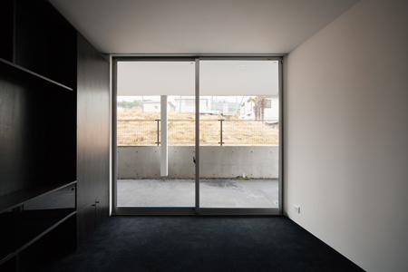
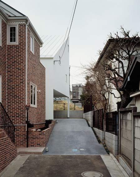
The site faces each different environment, such as a heavily-trafficked road to the west, a road on which almost only pedestrians walk to the south, electric train line across a coin-operated parking lot to the north, and a neighboring house to the east. Because of frequently blaring of railroad crossing and trains, and automobile traffic also, the site is placed in an environment in which creating an open space is generally difficult.
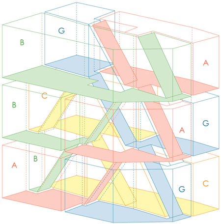
To create less relative merits for an environment around each unit as much as possible, a simple volume, formed by just offsetting the shape of site, is divided into two pieces; then each piece is divided again into smaller four pieces; and two spaces consisting of respectively four housing units are constructed with quadplex spiral forms.
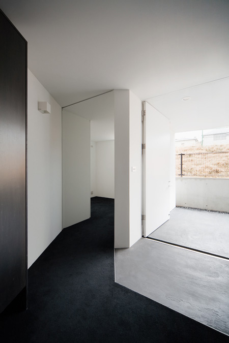
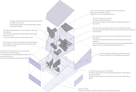
In each housing unit, a volume of space is misaligned in the counterclockwise direction every time of going upstairs to the upper floor. Layering small spaces and moving between floors with misalignment produces successfully a space with sense of abundant perspective which can’t be evaluated by its area.
On the basis of the quadplex spiral constitution, when boundary plane is constructed with reinforced concrete as a structure, vertical, horizontal, oblique planes appear like natural landscape; and these planes correspond to a floor, a wall, and a staircase respectively to form a space accepting a resident’s life.
The constitution is formed simply with the tri-layered same floor plan, and aimed to achieve both rationality and simplicity including problems of execution of work, and producing a complicate, diversified space. Along the seams where ceiling meets inner surface of external wall, slit-like openings with a height of five centimeters are provided to let in light, but not sight line.
Natural light shines softly in an interior from the slits like indirect lighting. In this situation of difficulty for openness, not only producing a closed space, but also I desired to develop a new environment which can’t be expressed with dichotomy between openness and closeness.
Though the housing units of the multiple dwelling are very small, it is focused to create a new space enabling an everyday-life experience which is different completely from general concept of space.
Project: MM APARTMENT
Location: Tokyo, Japan
Principal Use: housing
Architect:Yuji Nakae / NAKAE ARCHITECTS
Hirofumi Ohno / Ohno JAPAN
General Constructor: Matsushima kogyo Co., Ltd.
Site Area: 98.30m2
Building Area: 65.53m2
Total Floor Area: 196.59m2
Ground Level: 65.53m2
2nd Level: 65.53m2
3rd Level: 65.53m2
Structure: Reinforced Concrete, 3 stories
Maximum Height: 7750mm
Time for Completion
Design Period: Mar.2008 – Dec.2008
Construction Period: Jan.2009 – Aug.2009

DG House by Geneto


Japanese architects Geneto have completed a house in Tokyo dominated by plywood structures that form furniture and room devisions.
Called DG-House, the project features two main structures. The first combines bookcases, seating, a staircase and a mezzanine, while the second contains the kitchen.
Watch a movie about the project here.
Photographs are by Takumi Ota.
The text below is from Geneto:

DG-HOUSE
“The scenes of daily life”
It’s a private house in the quiet residential area in Tokyo.
How much big floor area we can get to the legal limit is usually demanded especially in densely built-up area. But the important is not the floor area but “the activities of daily life” = “the scenes of daily life”.
Thus, we tried to make the space by “the scenes of daily life”.
Within the discussion about “the scenes of daily life” with the client, we were getting to understand that’s daily casual activities or happenings like “conversation by husband and wife”, ” the sky looked from kitchen ” and “children’s birthday party”.
And these makes us feel the quality of life.
The composition was decided by the associating “the scenes of daily life” with the context being thought from the site and the laying it out in three dimensions.
Some private rooms are in the ground floor and the second floor is made as one big room and it makes “the scenes of daily life” be fulfilled by dividing each space with furniture.
Furniture in this house has a role like a stage set, to create the scenes of daily life we intended to.
Like there are various scenes in a film, it aimed to make a house that studded various scenes of daily life, like the dweller becomes a hero or a heroine.
“The volume in quality of life.”
GENETO has been thinking how we can make a space economically and functionally with the work of more than furniture less than architecture.
In the beginning project, re-ped(2001), we made the volume based on people’s activity by the plywood frame.
Since that, we have been trying to educe the potential of the space functionally by fitting the scale having more scale than furniture in the space.
Recently, our interesting tend to make various scenes by furniture, like furniture gives some aspects or some uses in the space.
In DG-HOUSE, we thought furniture is the volume producing various scenes rather than functional furniture.
The volume is made with the sequence of organic shape 24mm plywood frame. And the structure consists of fitting in the surface material plywood.
The volume is made by the method like the middle of how to make furniture with how to make architectural.
This method makes it possible to make architectural scale economically, keeping the scale of furniture.
Also the volume of children room works as the structure to support the architectural horizontal force when putting it in the second floor.
It is seen one mass by painting black on structural plywood when seeing a whole, keeping the feeling of wood when seeing in the vicinity. Also the black color toning has been done in our own factory.

Yud Yud by Davidclovers and C.E.B. Reas


Hong Kong studio Davidclovers and Los Angeles artist C.E.B. Reas have created a shop front in Hong Kong where LED lighting pulses through patterns cut in the surface of two large Corian doors.
Called Yud Yud, the project is an addition to Davidclovers’ own studio.
The doors are puckered in the middle by a diamond-shaped relief and squiggles are milled out of the surface, illuminated from behind by pulsing LEDs.
Watch a movie about the project here.
Here’s some more information from Davidclovers:

Yud Yud
by davidclovers and C.E.B. Reas
Yud Yud is the product of an evolving collaboration between davidclovers, artist C.E.B. Reas and DuPont China. It is the first application of back lit Corian™ exterior in China. Set within an old, medium density walking area of Wan Chai, Yud Yud stands in contrast to its surroundings. It builds upon the persona of the typical Hong Kong gate, pushing it toward the enigmatic. Designed from the interior to extend the pinup space of the davidclovers studio it is designed to be explored, touched and engage other forms of sight. Onlookers have been found rubbing it. It is an urban artifact not meant to be fully understood but capture and interact with one’s imagination.
Much of the visual and spatial ambiguity of the storefront lie in the tension designed between dimensions. For instance, two and three dimensions are blurred by both forming and etching an otherwise matte, Corian™ facade. The design engages the fourth dimension using animated LED lighting that produces a “twilight” affect. What appears heavy and dense at moments reverberates between opaque, translucent and transparent; slowly pulsing etched lines appear and then fade out and disappear.
The storefront has both operable and fixed components. Each apply DuPont Corian Solid Surface™ to a wall sandwich composed of a welded steel frame, inset animated LED light system, sheathed in the front with treated plywood and in the rear with aluminum panels. The form of the storefront is simultaneously guided by the basic physics of door swings and a capillary-like plasticity. Mostly flat, the storefront uses 15cm to produce a very subtle pucker-like formation that spans across the doors. Each leaf is symmetrical and comprised of three facing pieces of Corian Solid Surface™ that are seamlessly joined together using a liquid form of the same material.
The unique application of Corian™ lies not only in its exterior use and translucency but the combination of techniques overlaid and oscillating across one another; each adroitly executed by SpeedTop Hong Kong. At one scale – the scale of the door – sheets are thermoformed, a pressure reflected in the subtlety of the design. At a smaller scale – that of the ornamental texture – CNC tool paths swim through the substrate to produce calligraphy-like formations. Each scale was designed three dimensionally and rides the limits of both the material and their processes.
Similar innovation is explored at the level of software programming. Reas’ algorithmic, 2D Processing line work was a launching point for the collaboration with davidclovers. These dense, animated, line, networks (typically shown in prints or on screen) evolve endlessly. They are software process as art. Reas developed a custom software application for this project and Lunar House with knobs that allow sampling, sorting and the adjustment of line work.
Making these processes material is the intersection between Reas artwork and davidclovers’ architecture. Line quantities are reduced and edited, but they are anything but stabilized. Each line is reactivated in multiple ways. First, by forming tool paths three dimensionally shadow lines vibrate and translucency varies. Cut into flat sheets of Corian™ prior to forming, each line is designed to capture artificial light and shadow; to snap in and out of focus. The overall “tooling” (using large 1.5 meter x 2 meter wood molds) and forming was calibrated in relation to the CNC milled texture. Rather than encapsulating the texture between seams, it moves across them, bending and cornering. This requires an intricate three dimensional choreography of the CNC texture with each corresponding, formed, Corian™, sheet. Once they are aligned, this detail allows the texture to at once flatten the overall form (moving across edges), as much as augment it (deepening, drifting and fading in and out within it).
Finally, the wall section cavity and depth is regulated with each of these parameters. Where the texture is the furthest from the lighting it is the deepest and most intense, where it is the closest it fades out. This adds a delicate, effulgent quality to the slowly dimming and brightening LED’s as their light courses through each three dimensional line – appearing as if the texture itself is phosphorescent. It is this tight integration, spanning across media and use of constraints that ultimately produces the enigmatic somewhat preternatural character Yud Yud, awaiting interaction in this overlooked morsel of a neighborhood in Hong Kong.

Blog Archive