Wednesday, March 31, 2010

UK Pavilion at Shanghai Expo 2010 by Thomas Heatherwick


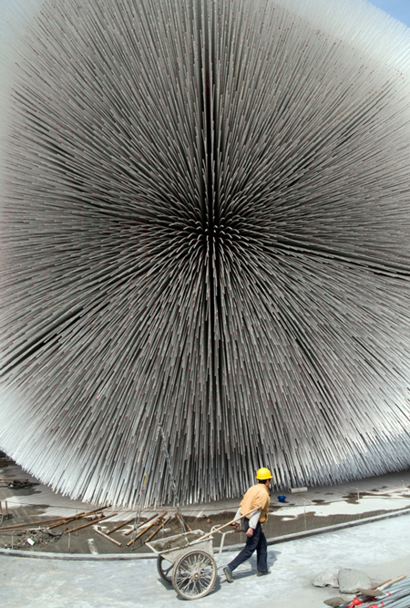
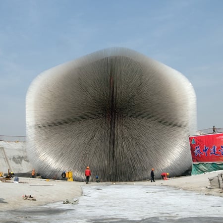
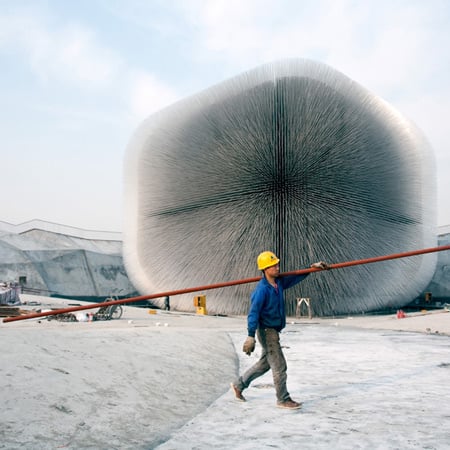
Thomas Heatherwick’s UK Pavilion is nearing completion for the Shanghai Expo 2010, which opens in May.
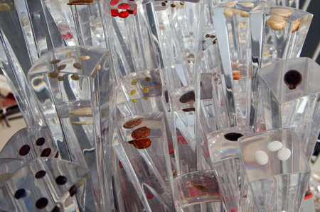
Called Seed Cathedral, the wooden structure is pierced by 60,000 fibre-optic rods that each contain plant seeds at their tips.
These rods will draw light into the pavilion during the day and direct it outwards at night.
After the expo the rods and seeds will be distributed to schools in China and the UK.
The Shanghai Expo will take place 1 May to 31 October 2010.
More information in our earlier stories here and here.
The following information is from Thomas Heatherwick

Musée national des beaux-arts du Québec by OMA


Dutch architects Office for Metropolitan Architecture have won a competition to design an extension to the Musée national des beaux-arts du Québec in Canada.
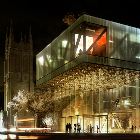
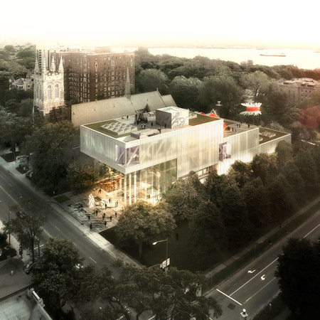
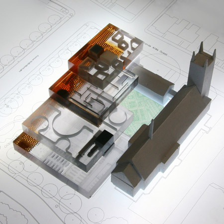
The winning design, announced today, is described as a “cascade of three overlapping boxes”.
See all our stories about Rem Koolhaas/OMA in our special category.
Here’s some info from OMA:
OMA WINS COMPETITION FOR MAJOR MUSEUM EXPANSION IN QUEBEC CITY
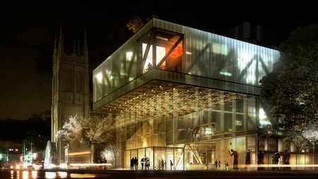
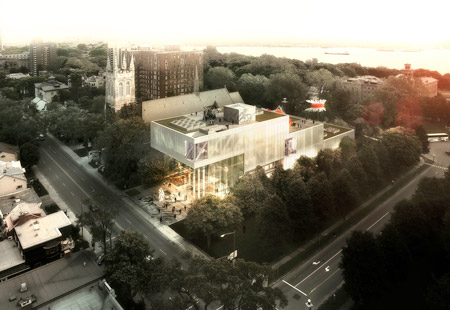
New York, 31 March 2010 – The Office for Metropolitan Architecture (OMA), has won the competition for a major expansion to the Musée national des beaux-arts du Québec (MNBAQ). The 12,000m2 new building, a cascade of three overlapping boxes at the juncture of downtown Quebec City and the historic Battlefields Park, will be OMA’s first built project in Canada.
The winner was announced today by MNBAQ President Pierre Lassonde and the Quebec Minister of Culture, Mme. Christine St-Pierre. The design, led by OMA partners Shohei Shigematsu and Rem Koolhaas in collaboration with associate Jason Long, was chosen unanimously from five submissions by internationally renowned architecture offices.
OMA’s expansion of MNBAQ – linked underground with the museum’s three existing buildings – is located on Quebec’s main promenade, Grande-Allée, adjacent to St. Dominique Church. The design aims to integrate the building with the surrounding park and initiate new links with the city. Three stacked galleries of decreasing size – housing contemporary exhibitions (50m x 50m), the permanent contemporary collection (45m x 35m) and design / Inuit exhibits (42.5m x 25m) – ascend from the park towards the city, forming a dramatic cantilever towards the Grande-Allée and a 14m-high Grand Hall, welcoming the public into the new building.
Shohei Shigematsu commented: “Our ambition is to create a dramatic new presence for the city, while maintaining a respectful, even stealthy approach to the museum’s neighbors and the existing museum. The resulting form of cascading gallery boxes enhances the museum experience by creating a clarity in circulation and curation while allowing abundant natural light into the galleries.”
The project will be executed by OMA’s New York office in collaboration with Provencher Roy + Associés Architectes, with an anticipated completion date of fall 2013.

Tuesday, March 30, 2010

shrub-tables-by-zhili-liu


'Shrub' tables by Zhili Liu for Quinze & Milan, 2010
To be exhibited at next month’s Milan Furniture Fair by Belgian manufacturer Quinze & Milan are a collection of tables by Chinese designer Zhili Liu called ‘Shrub’. Made of wet-lacquered, power-coated aluminium, the pieces use exposed sunken screws to the hold in position a network of ‘branches’, which together form the tables’ legs.
Detail of 'Shrub' table by Zhili Liu for Quinze & Milan, 2010
Of the tables, the designer says: ‘Chinese manufacturing is usually famous for large quantity, low quality and very limited new material and technology. So for Chinese designers, creating low quantity products with high quality in both design and manufacturing has always been a tougher task than it is in most other places. I have been trying to create high specification products with typical Chinese industrial materials and basic techniques, through unusual design and engineering, and these tables are the first prototypes in this direction – which I believe could be another route for “Chinese design” aside from reinterpreting the traditional decorative elements.’
'Shrub' table by Zhili Liu for Quinze & Milan, 2010

Diamond House, Santa Monica, California, USA, by XTEN Architecture


Diamond House - Primary night, by Art Gray

Diamond House is a house extension designed by XTEN Architecture as a patterned and perforated lantern illuminating a California canyon. It is located against a sloping hillside, with minimal access and little space upon which to build.
Diamon House, North view, by Art Gray
Because of the challenging geotechnical conditions of the spot, Diamond Housed required 9m caissons to underpin new walls and foundations. A complex web of regulations governed the height, width, depth and specific relationship to the retaining walls needed to build the project.
Diamond House Patio View, by Art Gray
Given these constraints, a multifaceted architectural strategy was developed for the small building. First, a base building geometry was developed to conform to the hillside and required codes while maximizing the interior spaces by extending them into adjacent sideyards.
Diamond House, Roof Deck, by Art Gray
The building geometry also conforms to the interior program as a series of wall planes fold up and over the building to create a rooftop railing and enclosure.
Diamond House detail, by Art Gray
The facade pattern was created from natural elements taken from the canyon site.
Diamond House detail, by Art Gray
The10mm thick Swiss pearl fibre cement panels shown on the final construction were selected for both the way they relate to the masonry site walls and original structure, and for the fragility they impart to the otherwise hard-edged geometry of the building.

Plans

Diamond House PlansDiamond House - SectionDiamond House Wall SectionDiamond House Diagram

Project details

Architect: XTEN Architecture
Photographer: 
Art Gray Photography
Principals:
 Monika Haefelfinger &Austin Kelly, AIA, LEED AP
Client: Aisha Ayers
Contractor: Grendel Construction
Project Location: Santa Monica, California, USA
Completion Date: December 2009
Total Area: 250m² Interior, 150m² Roof Deck, 365m² Exterior Terraces/ Firepit Area
Landscaping/ Site Pieces: Mark Motonaga

Monday, March 29, 2010

YAKUZA LOU CHANDELIER BY EDDY SYKES


If the shape and movement of the Yakuza Lou chandelier by Eddy Sykes looks familiar, think back to the paper fortuneteller games you may have used as a kid to impress friends with your ability to predict the future.


sykes_yakuza_lou2.jpg
The handmade chandelier is based on expandable surface articulation: the origami design allows the chandelier to unfold to nearly twice its size. Within the folding planes are delicate glass bulbs that reflect off the brass surfaces and shine through the perforations within the pattern.


sykes_yakuza3.jpg
Sykes explains the range of light and movement:
"When the chandelier is closed, the lights are off and hidden. When the chandelier is turned on, the source lights 'unfold' and begin to increase illumination in sync with the expansion of the piece. A special dimmer control increases lighting wattage so the level of light is related to the size and position of the chandelier itself.


sykes_yakuza4.jpg
The lighting is brightest when the chandelier is fully open. A programmable remote controls both the lighting and the action so the level of light can be adjusted independently of the sculpture itself.


sykes_yakuza5.jpg
The user can have the light intensity relative to the chandelier over the course of a few seconds to a few hours, gradually illuminating a space to create an experience akin to a time lapse film of a flower blooming or a snowflake forming.


sykes-yakuza6.jpg
A simple 12-volt motor that opens and closes the chandelier is integrated into the fixture, so no special wiring is required."

University of Liverpool Heating Infrastructure by Levitt Bernstein


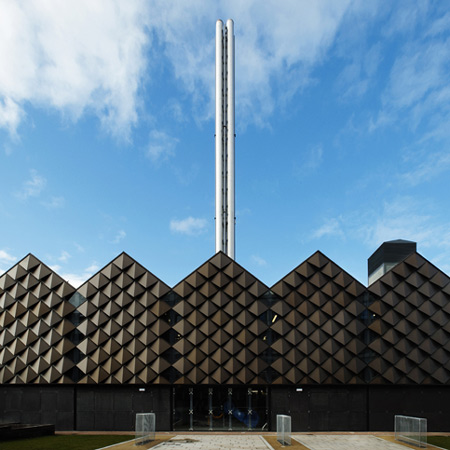
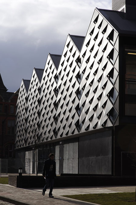
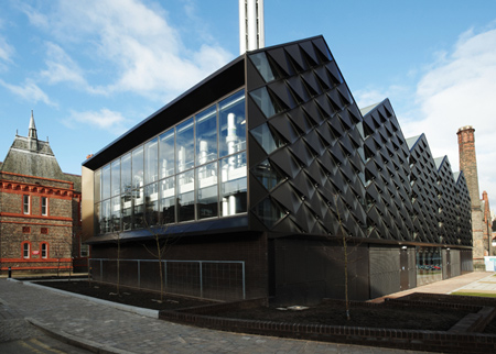
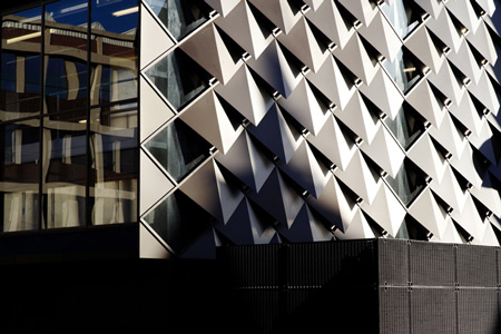
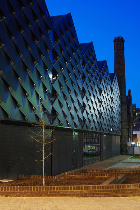
London office Levitt Bernstein have completed an energy centre for the University of Liverpool in the UK, clad in diamond-shaped aluminium scales.
The new building has five pitched roofs, while glazed sections alternately reflect the surrounding listed buildings and allow glimpses of the machinery inside.
Called University of Liverpool Heating Infrastructure Project, the building houses a new energy system that links two existing networks to provide hot water for the whole campus.
The information that follows is from the architects:

University of Liverpool Heating Infrastructure Project
This project sees the construction of a new, central energy centre to serve the whole of the University of Liverpool’s campus. The design of the new building responds to its sensitive location, within the University’s historic core, and on the principal circulation spine linking the north and south campuses.
The incremental growth of the University had resulted in a system with two separate high temperature hot water systems, operating at different conditions, and leading to inefficiencies in the operation and management of the estate. One was based around a gas turbine–powered combined heat and power plant – the first such installation in a British university when installed in 1985 – and the second was a conventional boiler plant dating from 1966.
A single high temperature hot water system has been constructed, based around the two existing distribution networks. A first contract, undertaken in 2007, linked the two systems, and the second has created a new single energy centre, providing high temperature hot water to the whole campus, with some standby capacity to allow for one boiler to be unavailable for any reason during heating periods.
The site for the new energy centre was previously used for car parking, and is located adjacent to the Liverpool Royal Infirmary buildings recently acquired by the university. It is therefore situated in a sensitive and historic part of the campus, surrounded by listed buildings between the Waterhouse-designed Victorian hospital and the historic core of the university.
The three hospital ward wings terminate with arched balconies facing Dover Street. The new building refers to this context, forming a fourth wing and third courtyard, and repairing the previously disjointed and unsatisfactory urban realm. Its glazed facade facing Dover Street responds to the inset arched balconies and provides tantalising glimpses of the massive boilers, pumps, ducts and valves within the energy centre.
An unusual design solution was needed to satisfy the brief, programme and context of the project. The programme required a planning consent before the final choice of principal plant could be made, whereas only then would the precise size, maintenance and ventilation requirements of the gas engine and boilers be known. We therefore developed a cladding system which avoided the need for any conventional louvres or ventilation grilles, and which can be dismantled to provide access for maintenance and replacement.
The diamond-patterned aluminium cladding is profiled to permit ventilation at any point. Its scale, texture and colour respond to the historic context, which is characterised by a varied roofscape of pitched roofs and facades decorated by openings, string courses and cornices. Overall the new building sits easily beside its Victorian neighbours, without copying any of their materials or details. Depending on lighting conditions sections of glazing permit reflections of adjacent facades, or allow views into the energy centre.
The new energy centre includes a 4 million voltampere natural gas powered combined heat and power plant, comprising of 3×12Mw boilers and a 3.4Mw(e) gas engine.
Removal of redundant plant and alterations, adaptations and extensions of the buried High Temperature Hot Water (HTHW) system to link the south campus to the combined heat and power plant (CHP) have transformed the district heating mains network for the whole campus. High and low grade waste heat from power generation is recycled for domestic hot water and to improve the efficiency of heating buildings during peak demand. An estimated 6,700 tonnes of CO2 will be saved annually
Saturday, March 27, 2010

Zenden Hotel and Swimclub


Zenden-Hotel1
Wiel Arets Architects designed the interior of the Zenden Hotel and Swimclublocated in Maastricht, Netherlands.
Here is the project description:
The Zenden Hotel and Swimclub is located within three monumental town houses near the river Maas in Maastricht, the Netherlands. During the renovation, the scattered program was re-crystallized into an iconographical and integrated whole.
Newly created openings in the hotel’s walls allow for views between all areas of the new program, as well to as the exterior. The renovation led to an abstraction of the structure in both plan and section, not least because all ceilings heights were kept to a maximum. The resulting interior sculpture is completely clad in white, while the exterior inversions are painted anthracite.
Upon entering the hotel, a relaxing lounge welcomes guests and invites them to have a drink, admire the hotel’s pool or simply enjoy the red Japanese maple on the patio. From the lounge, guests can pace past the glass-clad wall in the entrance area and descend to the basement, where one finds the sapphire blue waters of the pool, which retains its original medieval vault. Oppositely, ascending the stairs, nine hotel rooms await their guests, each room unique.
Inside the four new guest rooms, services such as showers, toilets and cupboards have been condensed to blocks, enabling more living space. Corian inlays and night-stands have been integrated into the walls, washing tables placed on floating shelves, TV’s hidden behind reflecting glass and bathroom doors also serve as mirrors.
Zenden-Hotel2
Zenden-Hotel3
Zenden-Hotel4-1Zenden-Hotel4-2
Zenden-Hotel5
Zenden-Hotel6-1Zenden-Hotel6-2
Zenden-Hotel7
Zenden-Hotel8
Zenden-Hotel9-1Zenden-Hotel9-2
Photos by Jan Bitter and Joao Morgado

carabanchel-social-housing-by-foa


Carabanchel Social Housing
The architects based their design on a simple concept that is low-cost, sustainable and playful, experimenting with the standard ideas on social housing.
Carabanchel Social Housing
Design Team: Foreign Office Architects
Location: Madrid, Spain
Status: Completion 2007

Foreign Office Architects gave bamboo a leading role in the Carabanchel Social Housing project. There were two main reasons for doing so: it's eco-friendly and it's comfortingly cosy. Operating within a severely limited budget, the Carabanchel Social Housing project is 100 social housing units on the outskirts of Madrid. Regulations set the number of units and the percentages of every size. The maximum height was also a constraint, but not the alignment within the rectangular plot.
Carabanchel Social Housing

Given the adjacency to the future urban park and the North-South orientation of the site, our proposal is to compact the volume within the given height to provide a private garden for the units on the eastern side and to produce double aspect units facing both gardens. In order to achieve this, the units became elongated tubes that connect both facades. Thanks to the compactness of the block, we succeeded in providing fully glazed facades for all the exterior surfaces. The facades have been lined with a 1.5m wide terrace which provides a semi-exterior buffer space enclosed with bamboo screens mounted on folding frames. The screens protect the glazed surfaces from the strong East-West solar exposure, and are able to open to the side gardens when desired.Our target was to provide the maximum amount of space, flexibility and quality to the residences, and to erase the visibility of the units and their differences into a single volume with a homogeneous skin which is able to incorporate a gradation of possibilities.

The primary architectural effect of the building is not dependent on the architects vision, but as an effect of the inhabitants choice, as if the facade was a register at any given moment of a cumulative effect of individuals choices.

Carabanchel Social Housing

Blog Archive