Thursday, September 30, 2010

Panscape 2jo by Ninkipen

Panscape 2jo by Ninkipen
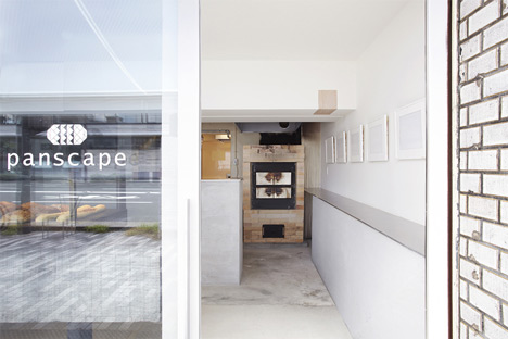
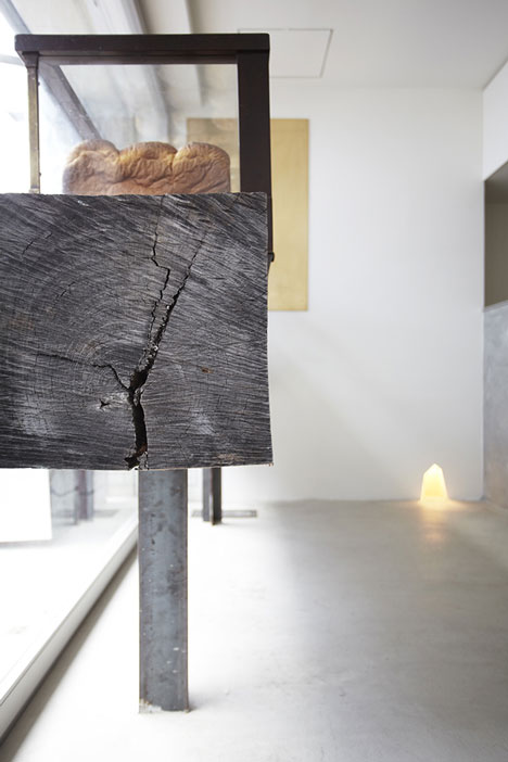
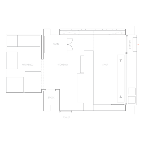
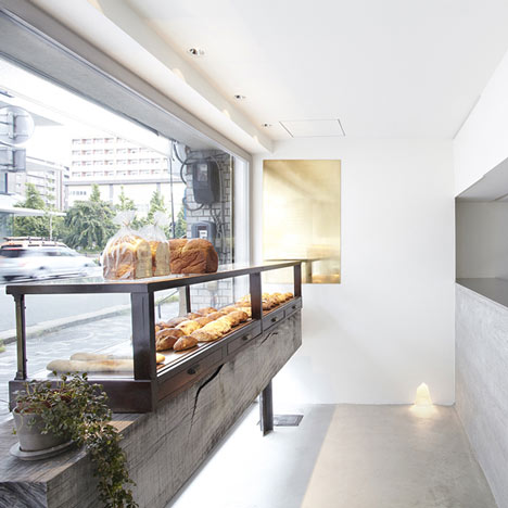
This bakery shop in Osaka has been refurbished by Japanese firm Ninkipen! with bread displayed on a wooden sleeper and the kitchen sat behind an exposed concrete counter.
Panscape 2jo by Ninkipen
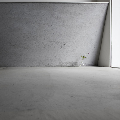
As well as the counter, an adjacent shelf, the interior floor and terrace are finished in concrete.
Panscape 2jo by Ninkipen
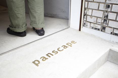
Panscape 2jo has a wood-burning oven opposite the entrance and two stools also made from sleepers on the terrace.
Panscape 2jo by Ninkipen
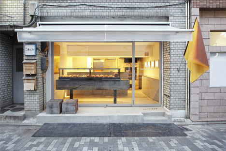
The shop’s existing sash windows, which faced onto the street, have been replaced with a curtain wall of glazing.
Panscape 2jo by Ninkipen
All photographs are by Hiroki Kawata.
Panscape 2jo by Ninkipen
Here’s some more from the architects:

This is the interior design for a bakery shop in Osaka.
This is on the first floor of the building which have particular atmosphere after buildings around here was rebuilt.
First of all, we tried to regain original expression by removing reformed aluminum sashes and setting the wooden sashes.
Panscape 2jo by Ninkipen
Next, in the inside, we developed the antique showcase a boulanger keeping with love by putting on the log weighs 500kg, and designed a long counter makes of aluminum has the thickness of 10mm to be able to display bread freely.
We are looking forward to mastering the space by repeating the trial and error like a stone oven putting here.
Panscape 2jo by Ninkipen

Wednesday, September 29, 2010

Minimalist House


Minimalist-House1
Shinichi Ogawa & Associates designed a minimalist court house for a couple in Itoman-shi, Okinawa, Japan.
The house is composed of four vertical plates as exterior walls and one horizontal plate as a roof slab. A functional layout is created by inserting a void of 3×18 meters, which is the court for the house, and a wall-like furniture into the concrete structure space.
The space composition is characterized by the division of the house into two areas by the wall-like furniture. The first area is composed of the living room, dining room and bedroom, while the other space is composed of the kitchen, powder room and study room.
The shower room, toilet and various storages are laid out in this wall-like unit, which also incorporates the services.
Minimalist-House2
Minimalist-House3
Minimalist-House4
Minimalist-House5
Minimalist-House6
Minimalist-House7
Minimalist-House8
Minimalist-House9
Minimalist-House10
Minimalist-House11

Thursday, September 23, 2010

Sperone Westwater gallery by Foster + Partners

Sperone Westwater Gallery by Foster + Partners
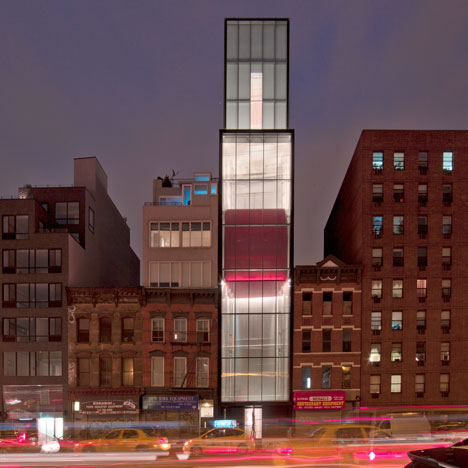
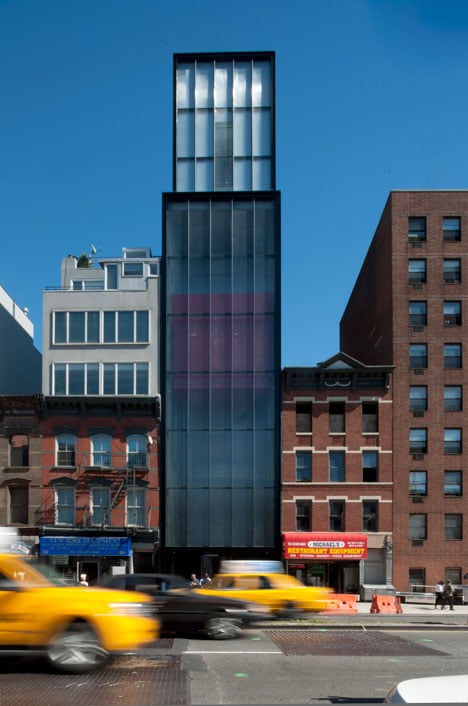
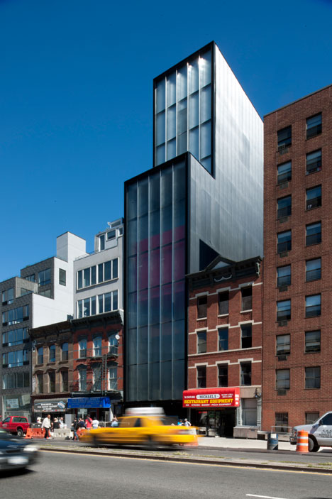
The Sperone Westwater gallery by Foster + Partners architects opened in New York earlier this week, featuring a moving exhibition space that connects the floors of the gallery.
Sperone Westwater Gallery by Foster + Partners
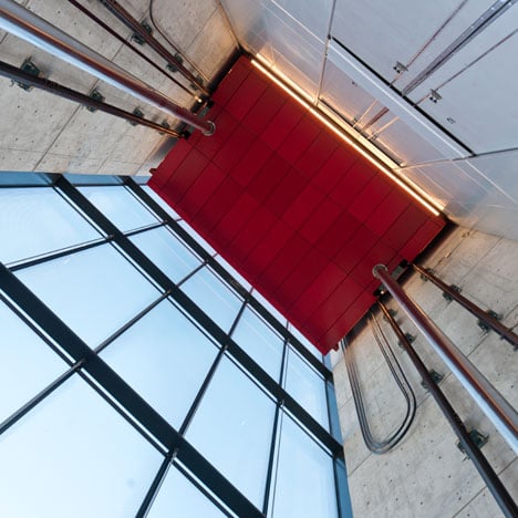
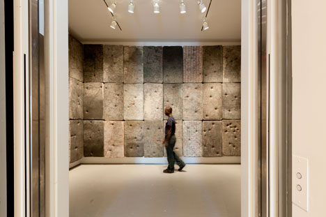
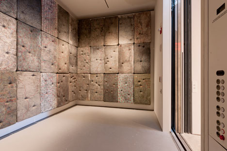
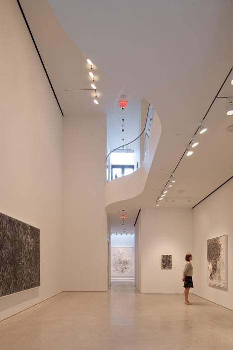
The 12 by 20 foot moving gallery allows visitors to travel between floors or can be fixed at a chosen level to extend the static exhibition spaces.
Sperone Westwater Gallery by Foster + Partners
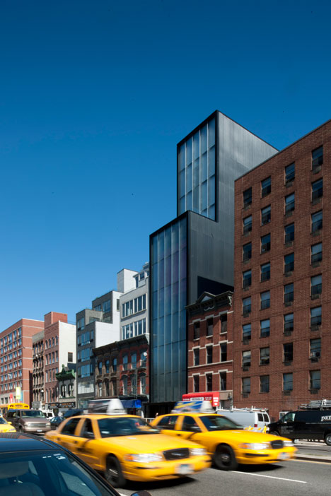
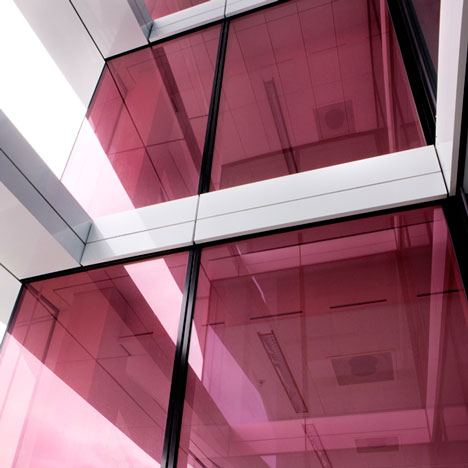
The milled glass facade of the gallery dampens noise from the street and controls the temperature and light admitted to the gallery spaces.
Sperone Westwater Gallery by Foster + Partners
Photos are by Nigel Young.
Here’s more from Foster + Partners:

Sperone Westwater gallery opens on the Bowery
Sperone Westwater celebrates the opening of its new gallery on the Bowery in New York with an inaugural exhibition by Argentinean artist, Guillermo Kuitca.
Sperone Westwater Gallery by Foster + Partners
Nearly 35 years after its conception, Sperone Westwater continues to exhibit an international roster of prominent artists working in a wide variety of media. Its new building, designed by Foster + Partners, doubles the exhibition area and pioneers an innovative approach to vertical movement within a gallery setting.
Sperone Westwater Gallery by Foster + Partners
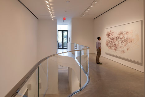
Responding to the compact 25 by 100 foot site, one of the features of the project is a 12 by 20 foot moving gallery, which connects the upper four exhibition floors and allows visitors to move gradually between levels. It is a prominent feature along the Bowery, visible from the street, its gentle pace contrasting with the fast-moving traffic. At any given floor, the exhibition space can be extended by parking the moving room as required, with an additional elevator and stairs providing alternative access.
Sperone Westwater Gallery by Foster + Partners
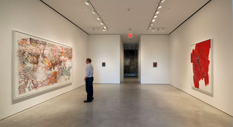
The gallery offers a range of exhibition spaces, which vary in proportion and ambience. The design incorporates a double-height, 27-foot high exhibition space at street level, with a sky-lit gallery, a mezzanine floor, a sculpture terrace overlooking a park, and private viewing galleries on the fourth and fifth floors.
Sperone Westwater Gallery by Foster + Partners
A setback at the sixth floor marks the location of the gallery’s administrative offices. Works of art will be stored primarily in the basement, while a library is located at the top of the building, below the mechanical floor.
Sperone Westwater Gallery by Foster + Partners
The milled glass facade that houses the moving room acts as a buffer zone, protecting the building from extreme temperatures and acoustically insulating the gallery spaces.
Sperone Westwater Gallery by Foster + Partners
Norman Foster commented:
‘The concept for Sperone Westwater represents both a response to the Bowery’s dynamic urban character and a desire to rethink the way in which we engage with art in the setting of a gallery. The moving gallery animates the exterior of the building and creates a bold vertical element within.’
Sperone Westwater Gallery by Foster + Partners
‘Like a kinetic addition to the street, it is a lively symbol of the area’s reinvention and a daring response to the Sperone Westwater’s major program. I hope that artists will be inspired by the gallery’s new spatial and structural possibilities.’

Wednesday, September 22, 2010

UNStudio Tower by UNStudio

UNStudio Tower by UNStudio
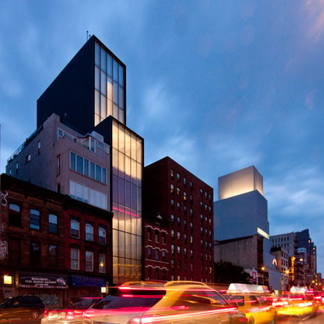
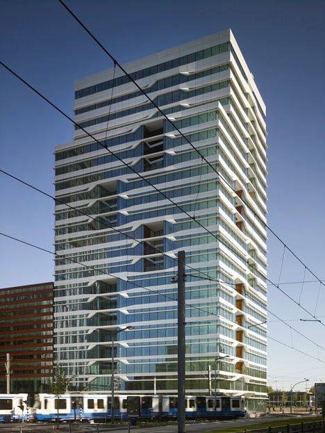
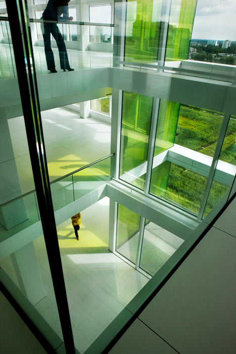
Dutch architects UNStudio have completed a 21-storey office tower in their hometown of Amsterdam with colourfully glazed recesses in the facade spanning multiple floors.
UNStudio Tower by UNStudio
Above photo by Christian Richters
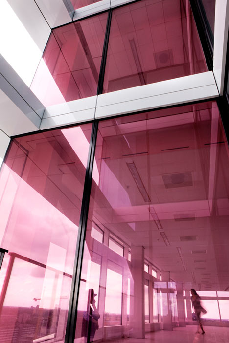
The tower’s voids allow light to penetrate deeper into the communal areas of the interior and are intended to make a greater connection between the interior spaces and the external facade.
UNStudio Tower by UNStudio
Above photo by Christian Richters
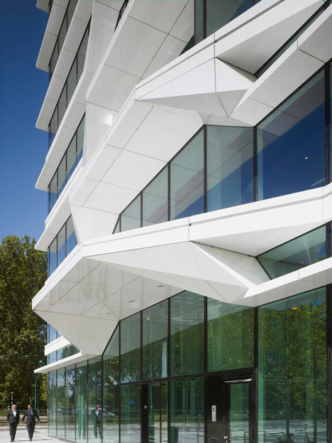
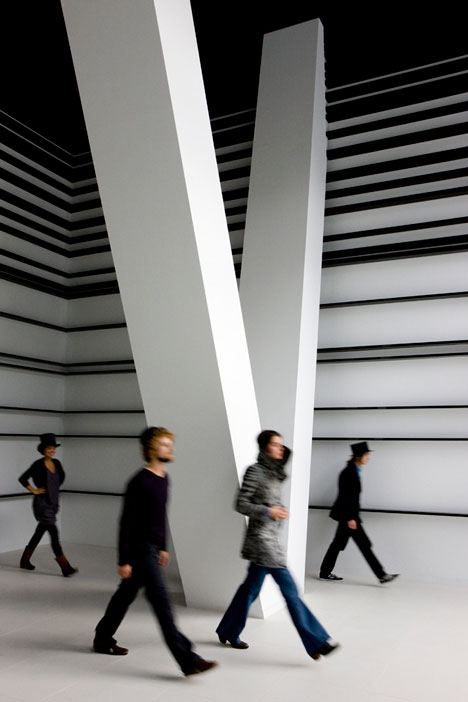
Bands of faceted aluminium cladding of various widths circle the building, controlling light penetration and sun screening to each floor.
UNStudio Tower by UNStudio
Above photo by Inga Powilleit
The tower is one of six towers that comprise the Mahler 4 urban complex, each tower taking the name of the firm responsible for its design.
UNStudio Tower by UNStudio
Above photo by Inga Powilleit
Here are more details from UNStudio:

UNStudio Tower, Amsterdam, Netherlands 2004 – 2009
The recently completed 21 storey UNStudio Tower forms part of the Mahler 4 urban complex, a cluster of six buildings located in the heart of the South Axis in Amsterdam. The South Axis connects Schiphol Airport to the major business areas of Amsterdam South.
The Mahler 4 urban complex houses 38.000 m2 of residential spaces, 162.000 m2 of office space and 30.000 m2 of street level retail, cafes, restaurants and a sports centre. The six towers in the Mahler 4 complex range in height from 85 to 100 meters, with each building carrying the name of its designing firm. The Mahler 4 complex has been nominated for the FGH Real Estate Prize 2010.
At a height of 82.5 meters, the UNStudio Tower contains 20 floors of office space and a ground floor with mezzanine. The Royal Bank of Scotland currently occupies 9 floors of the building and the South entrance with commercial space on the Gustav Mahlerlaan.
UNStudio Tower by UNStudio
Above photo by Inga Powilleit
UNStudio Tower
The façade of the UNStudio Tower plays with the juxtaposition of a horizontal and vertical articulation, conceptually relating to the principles upon which the moiré effect is based.
The horizontal articulation is provided by white, aluminium bands which wrap the tower, whilst their varying size, depth and transparency ensure the correct balance of sun screening and light penetration to the interiors on all levels of the building.
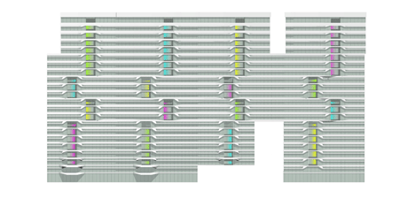
Vertical accents are formed by voids, recessed into each face of the building and spanning differing numbers of floors. These voids serve to create an inside-outside relationship which extends the façade envelope and turns the surface of the tower into an active medium with a profound effect on the quality of the interior user space.
UNStudio Tower by UNStudio
Click for larger image
Ben van Berkel: “In the design for the tower it was important for us to create a connection between the façade and the interior spaces; to see the building as whole, almost like a piece of furniture.”
Custom coloured glass panes are incorporated into the vertical voids, offering different identities and light qualities to the communal spaces which surround each void in the interior. These voids further facilitate daylight penetration deep into the extensive 40m x 40m floors.
Voids are often placed at the center of a building, but here they are placed at the perimeters. This has three major advantages:
The voids are easily transformed into (internal and external) balconies
The usable floor space is larger and can be planned more flexibly. The depth of the floors further ensures a high façade to gross floor ratio, whilst the building as whole has a 90% net to gross ratio.
The quality of the void spaces is affected by their location. Instead of public circulation space, these voids offer space for small meetings or personal reflection.
UNStudio Tower by UNStudio
User experience
Whereas conventional office buildings with their strict separation of inside and outside can be experienced as somewhat confining by contemporary office workers, the transparency of the primarily glass façade, in combination with the vertical voids, offers the user a gradient experience of the inside-outside condition, as well as the perception of an open and light interior. The outdoor spaces which are incorporated into the recessed voids in the form of roofed balconies allow for transition from inside to outside during free time or breaks. In addition, a roof terrace with a sky view towards Amsterdam Old South can be accessed for larger outdoor gatherings.
Attaining sustainability
UNStudio sees sustainable design as an integral aspect of contemporary architecture. Sustainable solutions are not treated as add-ons, but related to each and every building element.
In the design for the UNStudio Tower integrated sustainable solutions include:
Materials: the reduction of replacement frequency through the use of high quality durable materials and equipment throughout the building, along with the incorporation of a lightweight frame (resulting is less construction material usage in the foundations).
Climate: the façade design incorporates sustainable considerations with respect to orientation, with lamellas of differing heights, widths and depths controlling both direct sunlight penetration and noise pollution to each face and level of the building.
Thermal glazing allows for sufficient daylight, whilst reducing direct sunlight.
Energy saving installations: an underground energy storage system reduces energy usage by 30 to 35.7%. Energy efficient fixtures with motion sensors further control lighting level differentiation and thermal comfort. Sanitary installations include water saving cisterns and grey water usage.
Incorporating flexibility
Flexibility with respect to future change of use with an ambition towards minimum alteration was paramount in the design of the UNStudio Tower. Extensive research was carried out in collaboration with the client in order to determine where maximum flexibility could be incorporated into the design from the outset. As a result, the floor plans of the UNStudio Tower incorporate the potential for future residential use with no structural alteration required.
The vertical voids recessed into the façade of the building also offer the potential to be transformed into individual balconies on each floor for residential use in the future. The façade design further incorporates a system whereby the glass panes can be replaced with minimum intervention should a change of use become desirable.
Ben van Berkel: “A grid system was introduced into the UNStudio Tower which creates flexibility with a view to potential change of use in the future. There are currently many empty office buildings in Europe which cannot so easily be transformed, but the UNStudio Tower is designed in such a way that it could also one day be turned into housing. This provides an essential sustainable flexibility to the building.”
Tuesday, September 21, 2010

Plastic House


Plastic-House1
Architecture Republic designed the interior of this unique house inserting a cruciform object made of polycarbonate and steel.
Here is the project description:
The project begins with removal,  of the existing extension, internal walls and earth, bringing the entire house to lower ground-floor level. This opens the volume of the house as a double-height vessel, full of light.
A cruciform object is inserted; a piece of architectural furniture which spreads tree- like from a concentrated base. Services such as kitchen, toilet, storage and stairwell are housed within this trunk, providing for living and dining in the spaces around it.
Above this, is a platform for sleeping, dressing and study spaces. The four branches of the structure hold various functions, two which span to the side walls act as wardrobes while that to the front is a cantilevered reading desk for the teacher- client. The fourth branch extends through the rear wall and projects two meters beyond it housing a shower room, which is glazed to the sky.
The insertion is constructed with polycarbonate and steel. This lightweight structure is also the primary source of light in the evening, inset fittings cause its translucent surfaces to illuminate the spaces, which it generates above, below and between the object and its container.
Plastic-House2
Plastic-House3
Plastic-House4
Plastic-House5
Plastic-House6
Plastic-House7
Plastic-House8

Friday, September 17, 2010

New Kyoto Town House par Alphaville

New Kyoto Town House par Alphaville

Dans le quartier historique de Kyoto, les architectes japonais Kentaro Takeguchi et Asako Yamamoto fondateurs du studioAlphaville, bousculent les codes de la maison de ville traditionnelle japonaise, étroite et sombre. Ils ont imaginé des cloisons intérieures en bois clair aux formes polyédriques basées sur des concepts logiques et des fonctions multiples.
Photos © Kei Sugino et K. Takeguchi
+ Via Alphaville
0
Habituellement tendues dans le sens vertical et horizontal, les cloisons sont ici multidimensionnelles et connectent les pièces sur trois étages. L’espace ainsi créé forme une pièce en continu avec des nuances dynamiques: il est à la fois spacieux et hétérogène.
Les cloisons servent de réflecteurs, laissant entrer la lumière naturelle au nord et au sud pour inonder l’intérieur sombre de la maison et brouillent la frontière entre architecture et mobilier, se fondant dans les planchers et les plafonds.
234-1567891011121314151617
À propos : « The most characteristic feature of this house is the polyhedral form of the partition walls. They are not made by intuition but are based on logical concepts and perform multiple functions.
First, the partition walls, normally extended in the vertical and horizontal directions, have multidimensionality and loosely connect the rooms on the three floors. The space thus created is one continuous room with dynamic nuances: it is simultaneously spacious and heterogeneous.
Second, the partition walls serve as reflectors of natural light. They softly reflect the natural light coming from both the north and south sides and bring it to the otherwise dark interior of the building. Finally, the partition walls blur the boundary between architecture and furniture, thus stimulating perception and behaviour. Melt into floors and ceilings, the plywood-finished walls offer enjoyable experiences of touching and passing. The house as a whole is a machine for living, like playground equipment.
Influence in Asia
Because of the landscape regulations and the physical context of the neighbourhood, we inherited the traditional form and composition of townhouses. But at the same time, this house overcome the negative aspects of townhouses. The wooden structure of townhouses cannot afford to have large openings on the short sides of the building as well as on floors. Consequently, the interior is dark and communications of people are limited to the horizontal direction.
In this project, it is the steel rigid frame and the polyhedral partition walls that enable to overcome the drawbacks of typical townhouses. Large openings on the walls and the floors, along with the partitions, allow natural light to diffuse multidirectionally, and encourage three dimensional communications and movements.
Freed from the constraints of the old system, occupants can have various relations with each other and place, and a new lifestyle in the historical area of Kyoto emerges. »
181920

Blog Archive