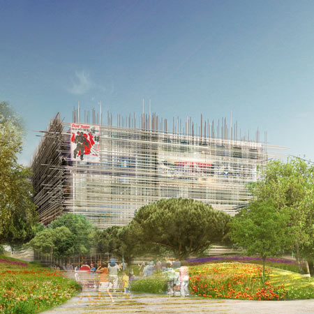
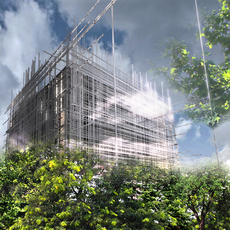
Paris studio OFF Architecture have won a competition to design a cultural centre in Cugnaux, France, with their design featuring a woven wooden façade.
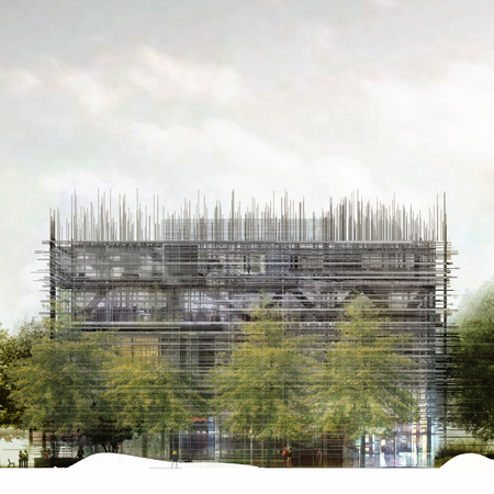
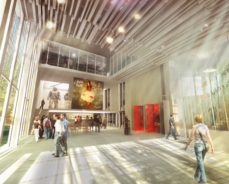
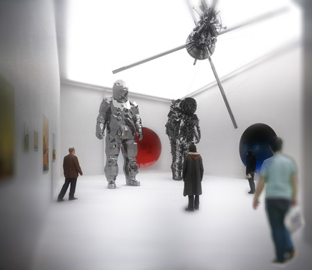
Called Paul Eluard Cultural Centre, the building will comprise a showroom, archive room, art school, library and amphitheatre, which will all be organised around a central open-air lobby.
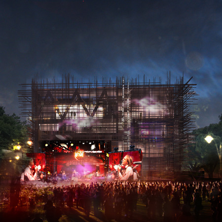
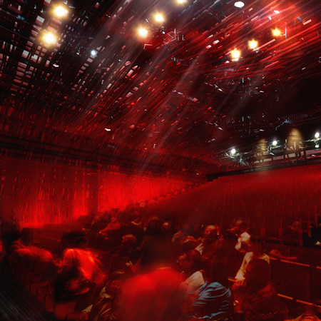
The amphitheatre will accommodate 400 seats and could be opened up on the north-east facade to create an open air concert or festival venue.
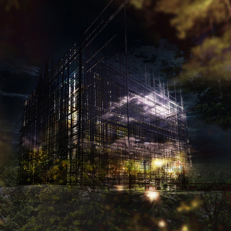
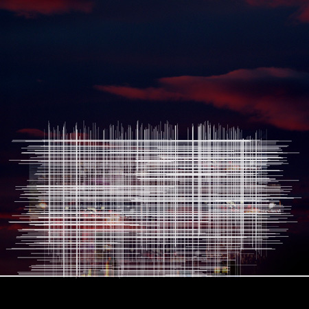
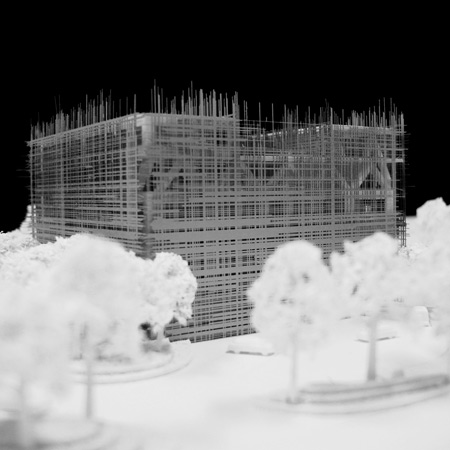
The woven wooden façade will include elements of different thicknesses and lengths, and also feature in some of the interior spaces.
Here’s some more information from the architects:
Cultural center Paul Eluard in Cugnaux, France – Winning Competition, January 2010, 1st prize
Cugnaux is a low density city that has an iconic historical downtown near by Toulouse.
Its urban network is suffering: the streets are unorganised, the shopping areas and services are split, the public spaces are useless and inappropriate.
The impact of the project had to be strong and radiate beyond the limits of Cugnaux, until the crown of Toulouse. It had to be a symbolic regional place for cultural exchanges and initiate an urban renewal for the city. But at the same time, the project should not break the scale of the neighbourhood – mainly consisting of a low density suburban fabric entangled in a dense vegetation.
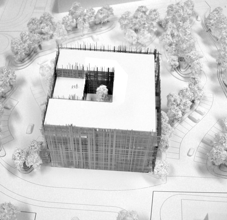
We developed a high and compact building (36mx36mx18m) that can be seen from all over the city. Indeed, it can be seen, located, identified from far and interacts with the old city church’s bell.
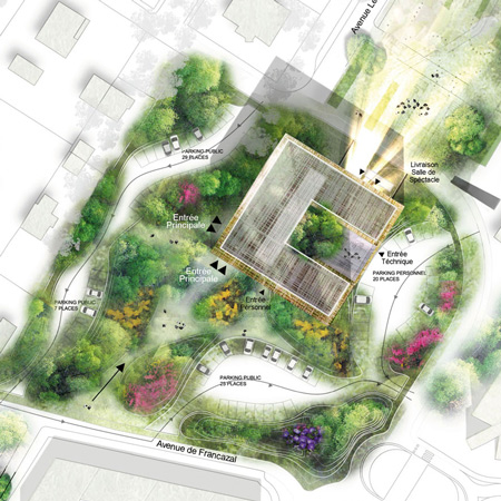
A movement on the ground floor organizes all outdoor and public spaces around the project.
A movement on the ground floor organizes all outdoor and public spaces around the project.
Thereby, a quality green landscaped park offers undulating hills to shelter actual or potential programs such as the parking or any garage sale, outside lounge, picnic. On the other hand, the vegetal canopy helps to break and adapt the scale of the building to the surroundings: the thin and long stems trees frame its height.
The main entrance of the building is served by a public square. It establishes a strong link between the building and the city and naturally leads the public to the lobby. Therefore, located on the ground floor, the spacious glazed hall is like an extension of the court allowing a smooth flow of circulations.
A “summer open position” creates a large lobby open to the outside, blurring even more the limits between interior and exterior. The square focuses Francazal Avenue, which is the main road from the downtown, and extends until the limits of the car park to facilitate the flow of motorized users.
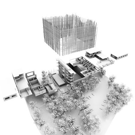
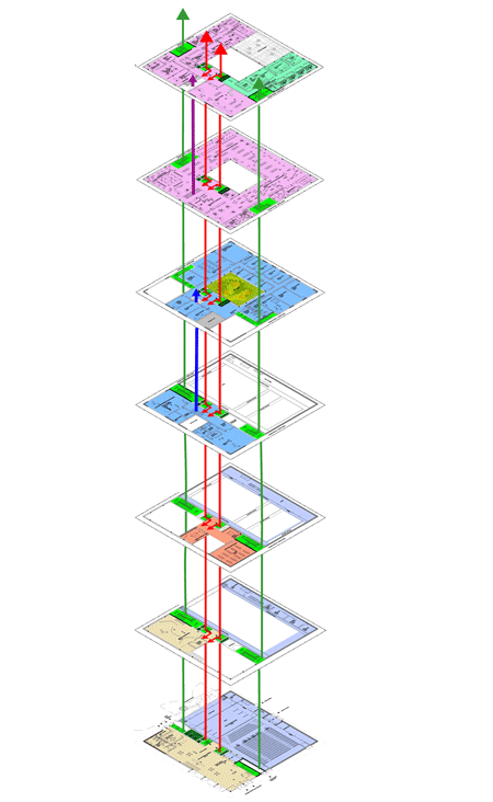
The general organisation of the project is functional: it consists of stacking simple programs-volumes. The building is designed as a very compact object punctuated to its center by a patio that spans three levels, bringing light and comfort.
All the vertical circulations of the building are organized in a central core accessible from the main lobby. Four lifts serve the different levels. Two are dedicated to the public whereas the others secure an access to the staff.
Thus, the flows of people are clearly identified and facilitate professional circulations between different poles: the showroom, the main venue/amphitheater, the municipal archives, the school of art education, the library, the cultural services and the technical rooms. The overall distribution of the programs allows each of the spaces to operate according to its own timetable and use.
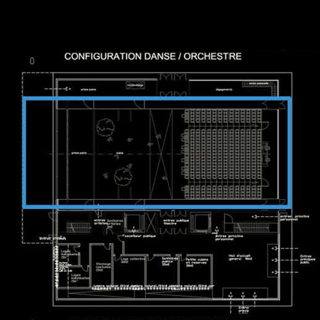
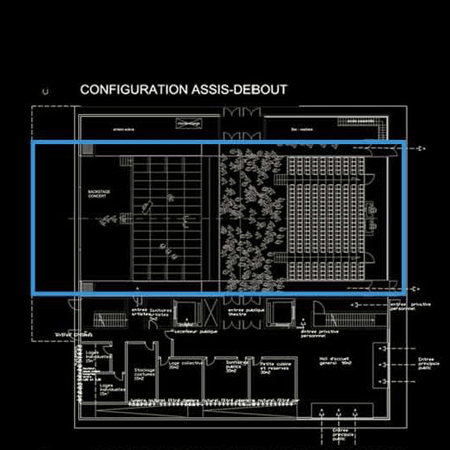
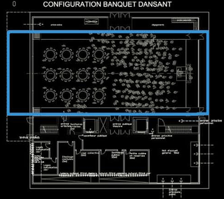
The main amphitheatre, directly accessible from the lobby, accommodates from 400 seats to 1000 standing people. Its arrangement offers the public the best conditions of visibility and listening. The use of mobile benches allows flexibility and mix of events : fairs, challenging, banquets dancing.
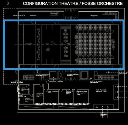
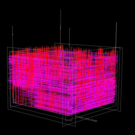
Moreover, the room can also be open on the outer north-east facade for concerts and festival events. Finally, the facade is part of the whole concept. It is both a protective mesh and a remarkable external sign: it is a woven wooden skin that plays with different densities an scales for an optimal filtering effect based on thermal, visual and ambient qualities for each program.
It provides a strong aesthetic that destroys the traditional perception of a building in terms of scale and is more concerned with developing the idea of an abstract urban signal. This organised-mess envelope blurs the traditional limits and design of a building that we usually get.
Client : Mairie de Cugnaux
Architects : OFF architecture associated to Duncan lewis Scape architecture.
Senography/ Museography : Ducks Scéno.
Structure: Iosis.
Acoustic: Viam acoustique.
Architects : OFF architecture associated to Duncan lewis Scape architecture.
Senography/ Museography : Ducks Scéno.
Structure: Iosis.
Acoustic: Viam acoustique.
Location : Cugnaux, France
Surface : 5000 m2
Budget : 7,5 M€
Project leader : Manal Rachdi and Tanguy Vermet,
Team : Matthieu Miquel, Lily Nourmansouri, Tiffany Chiang, Marie Lançon.
Surface : 5000 m2
Budget : 7,5 M€
Project leader : Manal Rachdi and Tanguy Vermet,
Team : Matthieu Miquel, Lily Nourmansouri, Tiffany Chiang, Marie Lançon.

No comments:
Post a Comment