Tuesday, August 31, 2010

The Narrow House


The-Narrow-House1
Architec Bassam El Okeily projected this curios house located in the small city of Bilzen, Belgium, with a wide glass front that fills the building’s modest width and stages the cubistic interior.
Here is the project description:
The house has a closed ground floor exterior ( topped by a total transparency in glass. The display window reveals two balconies in skewed positions projection from a white façade.

The lower balcony contains a reading corner for a library belonging to the gentleman of the house, while providing him with a sheltered view of the street. The upper balcony accommodates an artist’s studio, the private domain of his wife. Blue light turn the façade into a spectacular light sculpture after dark. it’s a narrow house in a narrow street, which offers the tale of a man , a woman and their passion.

Architecture become a pretext to chair something else than the sidewalk. A house is a space to live; it could also be a place to remain.
The-Narrow-House2
The-Narrow-House3
The-Narrow-House4
The-Narrow-House5
The-Narrow-House6
The-Narrow-House7
The-Narrow-House8
The-Narrow-House9

NYC Residence


NYC-Residence1
Stefan Boublil designed this apartment on the 61st floor on a metropolitan tower in New York that overlooks Central Park.
Here is the project description:
Combining 3 smaller apartments into one at one of new york city’s most coveted uptown addresses, we delivered a stunning new dwelling on the 61st floor of the metropolitan tower. Every single room is constructed so that the postcard view of central park is the star.
With a built-in wraparound sofa, a secret door in the solid walnut library and distributed surround sound all over the home, this project is an ode to the 80s during which the building was erected.
Suited for a family of 4 with 2 children, the communal living spaces stands in between the master suite and the kids’ rooms, hidden behind the aforementioned trap door in the library, thereby providing a buffer of sight and sound.
I might describe the final result as having a monastery + cowboy ranch + 80s vibe…
The kitchen and dining area is the only one wrapped in waxed concrete thereby giving it a theatrical feel, especially when seen from the rest of the apartment which is clad in bleached pine and subdued colors.
NYC-Residence2
NYC-Residence3
NYC-Residence4
NYC-Residence5
NYC-Residence6
NYC-Residence7
NYC-Residence8
NYC-Residence9
Photos by Michael Weber

Sunday, August 29, 2010

Red Nest by Paul Coudamy

Red Nest by Paul Coudamy
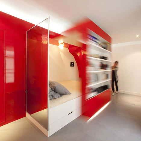
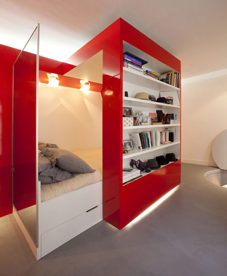
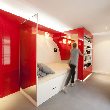
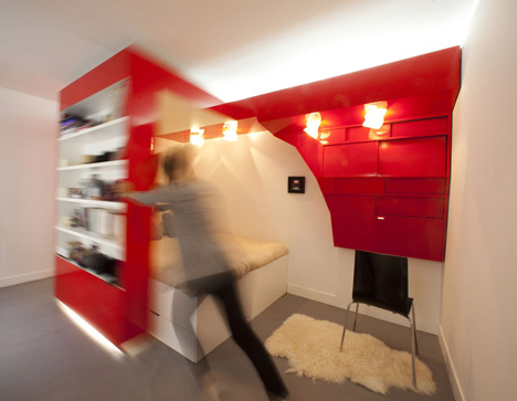
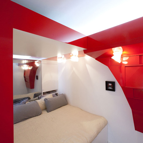
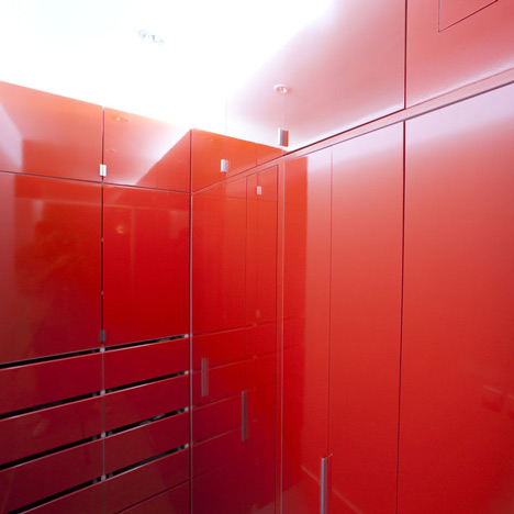
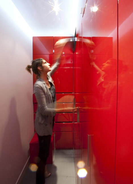
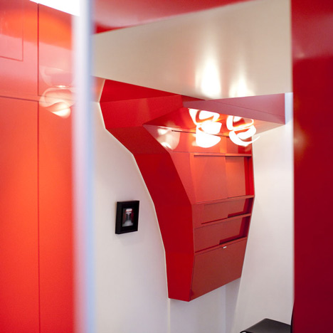
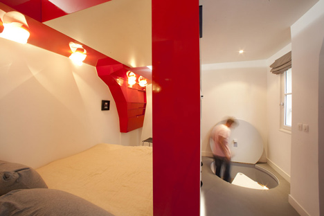
French designer Paul Coudamy has created this red-gloss sliding wall unit combining a desk, bed and wardrobe for an apartment in Paris.
Red Nest by Paul Coudamy
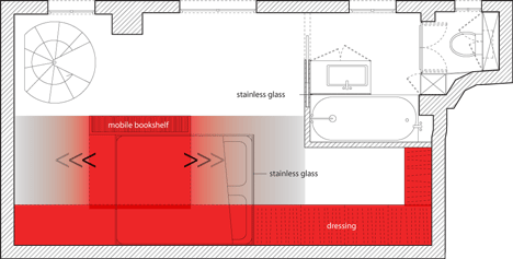
Red Nest has a bookshelf that slides along the wall to reveal or conceal the sleeping area, workspace and dressing room.
Red Nest by Paul Coudamy
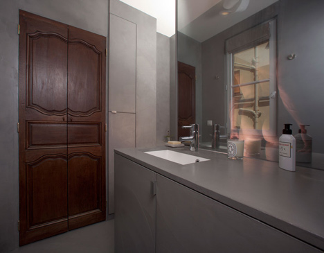
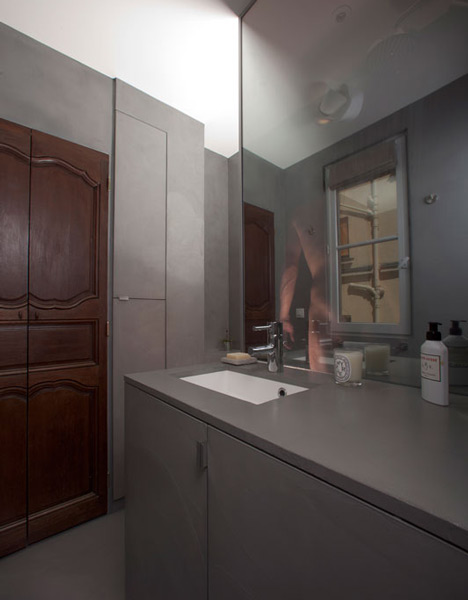
As part of the renovation of the 23 square-metre apartment the designer has also introduced a bathroom that sits behind a two-way mirror and has a WC concealed behind wardrobe doors.
Red Nest by Paul Coudamy
All photographs are by Benjamin Boccas.
Red Nest by Paul Coudamy
More about Paul Coudamy on Dezeen:
Red Nest by Paul Coudamy
Here’s some more from the designer:

Red Nest
The challenge was to provide a 23m2 space with a bedroom, a bathroom, a dressing and a working space. The design is based on a work on the porosity of spaces.
Red Nest by Paul Coudamy
The booshelf is a mobile block that enables to control the opening of the bed. Its U-shape covers the bed and shapes the room by closing the dressing, the bed or the working space.
Red Nest by Paul Coudamy
This mobile system provides a closed sheltered bed as wished by the client without completely shutting the space. A red carmine gloss paint reinforces the graphical dimension of the space and its delimitation by contrasting with the matt white walls.
Red Nest by Paul Coudamy
The disappearance of the spatial limits is reinforced bu the use of two-way mirrors that control the hidden and visible spaces according to the light.
Red Nest by Paul Coudamy
The bathroom is covered with resinated concrete and the restroom is hidden behind the doors of a fake vintage wardrobe.
Red Nest by Paul Coudamy
You can set the degree of intimacy between the bathtub and the rest of the room thanks to the two-way mirror above the basin.
Red Nest by Paul Coudamy
Click above for larger image
Red Nest
Design : Paul Coudamy
Project : appartment fitting
Location : rue Rollin, 75005 Paris
Date : 08/2010
Surface : 23m²
Project Director : Pierre Brochot
Photo courtesy Benjamin Boccas

Sugamo Shinkin Bank by Emmanuelle Moureaux

Sugamo Shinkin Bank by Emmanuelle Moureaux
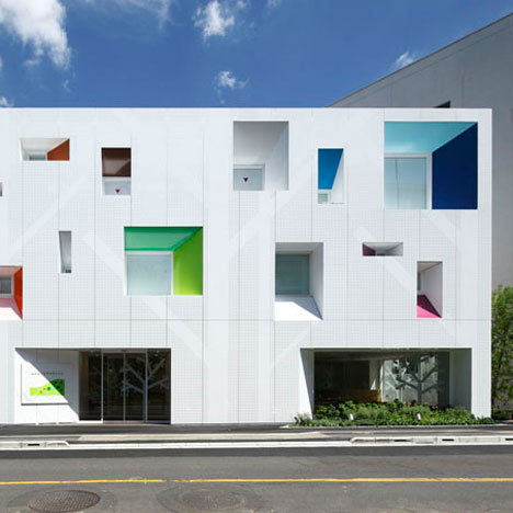
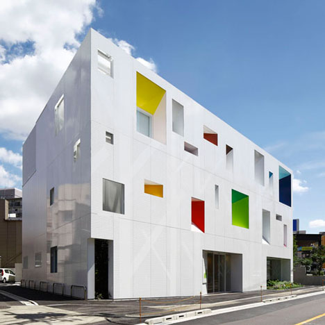
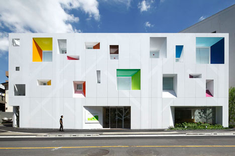
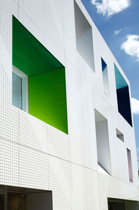
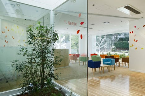
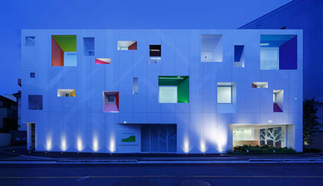
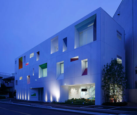
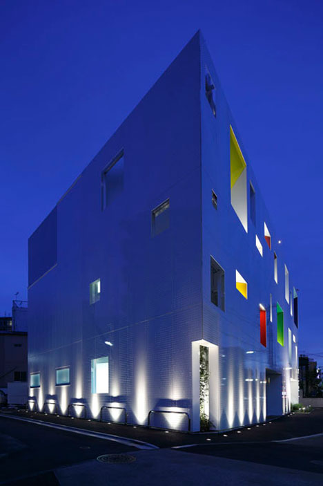
Emmanuelle Moureaux Architecture & Design have completed a bank branch in Tokiwadai, Tokyo, with recessed brightly coloured windows.
Sugamo Shinkin Bank by Emmanuelle Moureaux
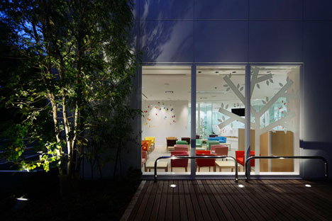
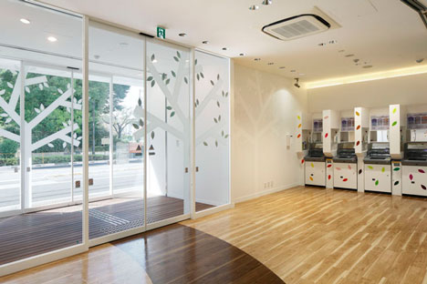
The facade also features a tree motif depicted in the perforations of the cladding.
Sugamo Shinkin Bank by Emmanuelle Moureaux
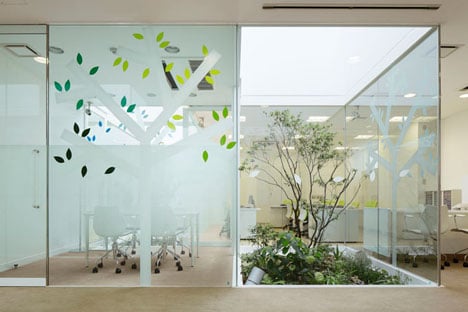
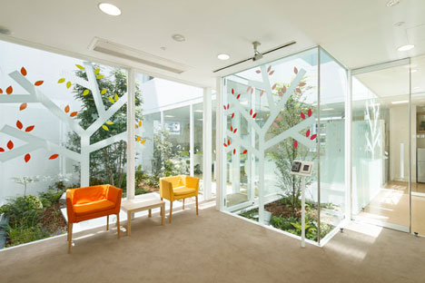
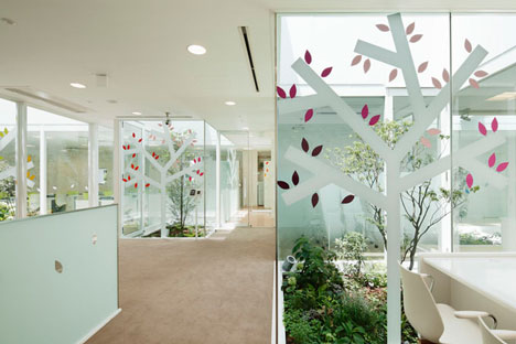
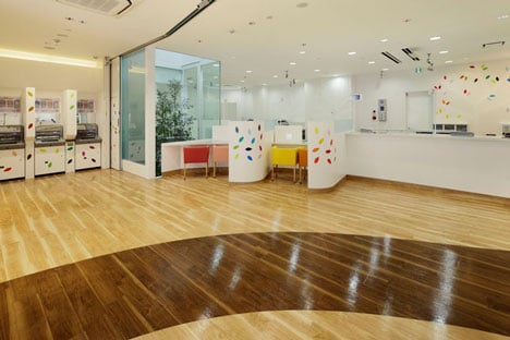
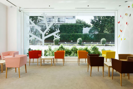
The motif continues through the interior with colourful graphics of trees and leaves.
Sugamo Shinkin Bank by Emmanuelle Moureaux
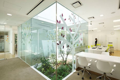
Living plants and trees have been introduced to the interior in seven vitrines illuminated with natural light.
Sugamo Shinkin Bank by Emmanuelle Moureaux
Photos are by Nacasa & Partners Inc.
Sugamo Shinkin Bank by Emmanuelle Moureaux
Here’s more info from the architects:

Sugama Shinkin Bank is a credit union that strives to provide first-rate hospitality to its customers in accordance with its motto: “we take pleasure in serving happy customers.” We handled the architectural and interior design for the bank’s newly relocated branch in Tokiwadai.
Sugamo Shinkin Bank by Emmanuelle Moureaux
By basing our design around leaf motifs, we sought to create a refreshing space that would welcome customers with a natural, rejuvenative feeling.
Sugamo Shinkin Bank by Emmanuelle Moureaux
The facade of the building features silhouettes of trees and an assortment of both large and small windows in 14 different colors arranged in a distinctive, rhythmical pattern that transforms the facade itself into signage.
Sugamo Shinkin Bank by Emmanuelle Moureaux
ATMs and teller windows are located on the first floor, along with 3 courtyards and an open space laid out with chairs in 14 different colors.
Sugamo Shinkin Bank by Emmanuelle Moureaux
The second storey houses the loan section, reception rooms, offices and 4 courtyards, while the third floor is reserved for facilities for staff use, including changing rooms and a cafeteria.
Sugamo Shinkin Bank by Emmanuelle Moureaux
Thanks to the 7 light-filled courtyards planted with trees and flowering plants, each of these spaces is loosely connected to all the others.
Sugamo Shinkin Bank by Emmanuelle Moureaux
A constellation of leaves in 24 different colors growing on the white branches of the walls and glass windows overlaps with the natural foliage of the real trees in the courtyards, creating the sensation of being in a magical forest.
Sugamo Shinkin Bank by Emmanuelle Moureaux
THE SUGAMO SHINKIN BANK / TOKIWADAI BRANCH
Main use : Financial Institution
Location : Tokiwadai, Tokyo
Structure : Steel, 3 storeys
Sugamo Shinkin Bank by Emmanuelle Moureaux
Site area : 656.94m2
Total floor area : 733.99m2
Open : June 2010
Photo credit : Nacasa & Partners Inc
Sugamo Shinkin Bank by Emmanuelle Moureaux

Tuesday, August 3, 2010

Hillside

The Regal Series Hillside of the Swedish label "Claesson Koivisto Rune" is set in its design with ups and downs. The forms are based on highly stylized mountain ranges provide the bright colors but still for an urban look. Closed and open parts provide sufficient storage space for these skulturalen shelves.


Blog Archive