Tuesday, June 28, 2011

cite-de-l’ocean-et-du-surf-by-steven-holl-architects-and-solange-fabiao


Cite de l’Ocean et du Surf by Steven Holl
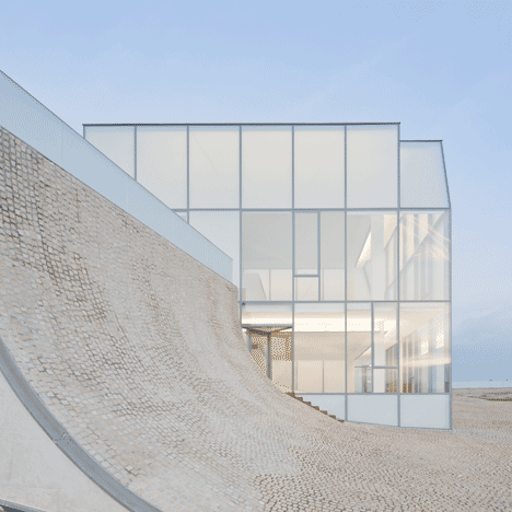
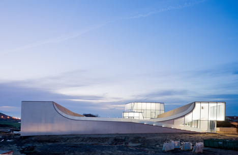
Steven Holl Architects have collaborated with Brazilian architect Solange Fabião on this wave-shaped museum of the sea in Biarritz, France, which opened this week.
Cite de l’Ocean et du Surf by Steven Holl
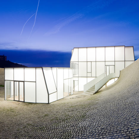
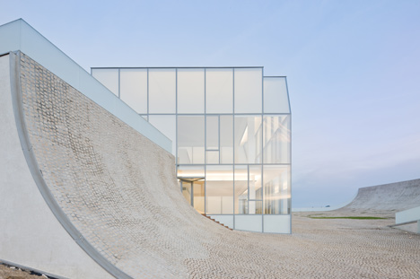
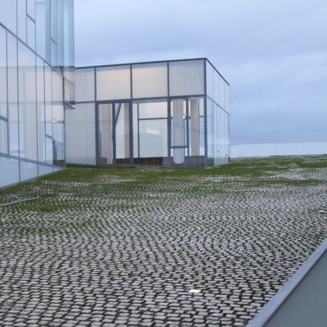
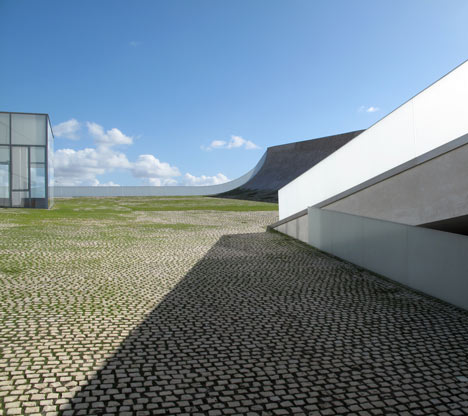
The Cité de l’Océan et du Surf has a cobbled plaza over the concave roof, which gently descends to meet the sloping ground.
Cite de l’Ocean et du Surf by Steven Holl
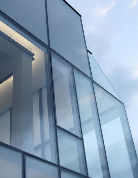
The galleries of the museum are contained within this curving concrete block, while two acid-etched glass boxes at one end accomodate restaurants and a surfer’s kiosk.
Cite de l’Ocean et du Surf by Steven Holl
The museum houses exhibitions about scientific issues associated with the sea and tides.
Cite de l’Ocean et du Surf by Steven Holl
Above photograph is by Steven Holl Architects
Photography is by Iwan Baan apart from where otherwise stated.
Cite de l’Ocean et du Surf by Steven Holl
Here are some more details from the architects:

Cité de l’Océan et du Surf opens in Biarritz, France
The Cité de l’Océan et du Surf, located in Biarritz, France will open to the public on June 26, 2011.
Cite de l’Ocean et du Surf by Steven Holl
Above photograph is by Steven Holl Architects
The museum, a design by Steven Holl Architects in collaboration with Brazilian artist and architect Solange Fabião, aims to raise awareness of oceanic issues and scientific aspects of surf and sea.
Cite de l’Ocean et du Surf by Steven Holl
Above photograph is by Steven Holl Architects
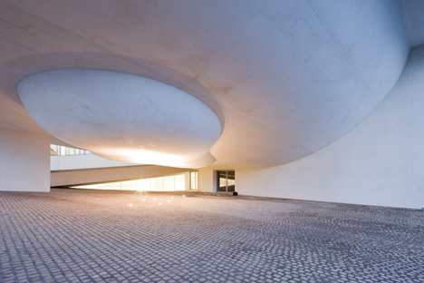
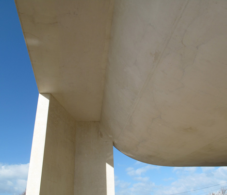
Derived from the spatial concept “under the sky” / “under the sea”, the museum’s concave exterior creates a central gathering plaza, open to the sky and sea, with the horizon in the distance.
Cite de l’Ocean et du Surf by Steven Holl
Above photograph is by Steven Holl Architects
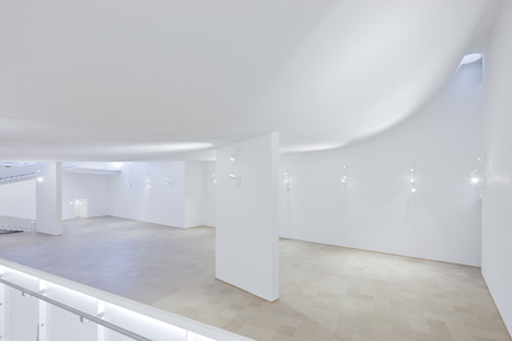
On the interior, the inverse convex curve becomes the ceiling of the main exhibition space, evoking the sense of being “under the sea.”

Monday, June 20, 2011

san-telmo-museum-extension-by-nieto-sobejano-arquitectos


San Telmo Museum Extension by Niento Sobejano Arquitectos
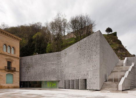
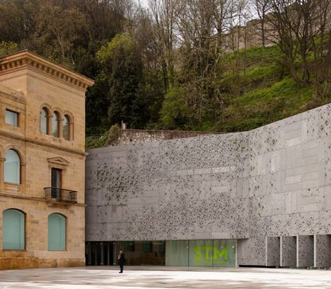
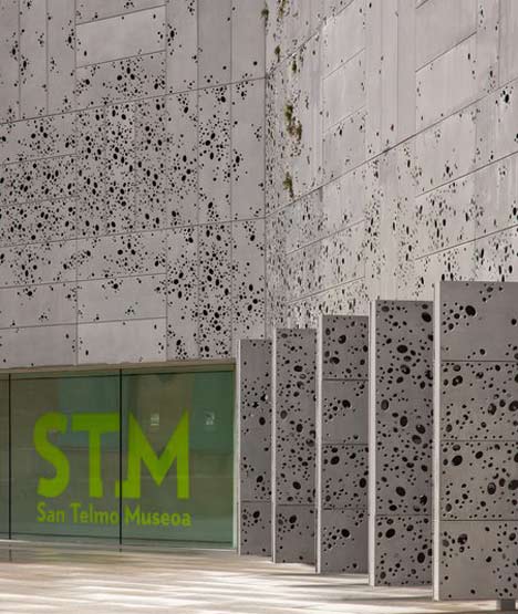
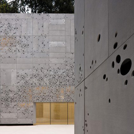
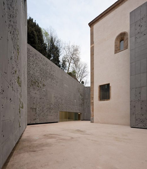
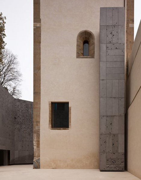
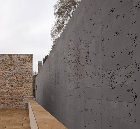
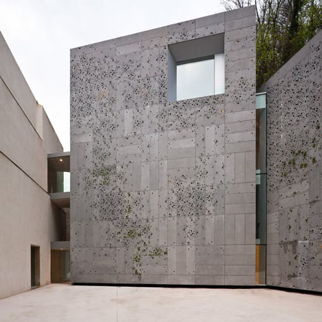
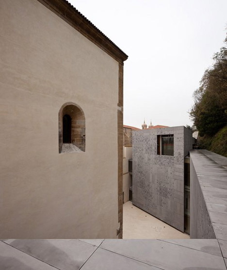
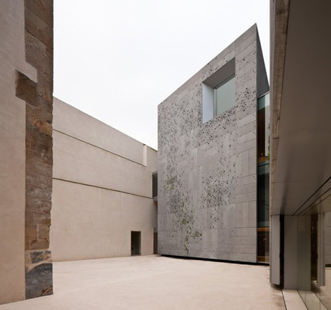
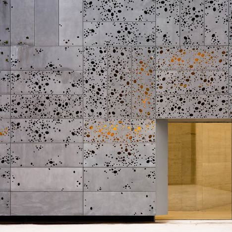
Moss is expected to grow on the perforated aluminium skin of this museum extension in San Sebastián by Spanish studio Nieto Sobejano Arquitectos.
San Telmo Museum Extension by Niento Sobejano Arquitectos
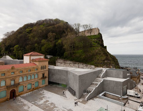
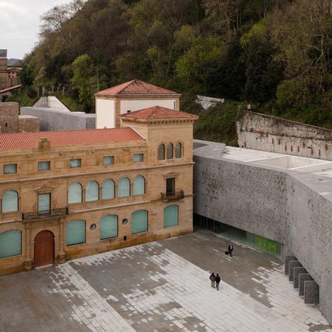
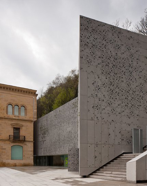
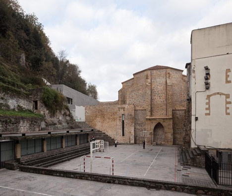
With its rear wall pushed into the edge of the hillside, the new two-storey block stretches out at a right-angle to the San Telmo Museum.
San Telmo Museum Extension by Niento Sobejano Arquitectos
A staircase ascends across the block, allowing vistors to climb over the roof and onto the landscape.
San Telmo Museum Extension by Niento Sobejano Arquitectos
The museum extension contains galleries for temporary exhibitions as well as an auditorium, library, teaching areas, cloakroom, shop and cafeteria.
San Telmo Museum Extension by Niento Sobejano Arquitectos
Photography is by Fernando Alda. See more images of this project onAlda’s website.
San Telmo Museum Extension by Niento Sobejano Arquitectos
This information is from the architects:

San Telmo Museum Extension
Competition 1st Prize 2005
The Museum of San Telmo, in its present condition, represents the result of a long process of successive modifications which has partially altered its physical and functional character over the years.
San Telmo Museum Extension by Niento Sobejano Arquitectos
Its location on the fringe where the urban structure meets the topography of Monte Urgull is a reflection, on the other hand, of an urban problem very characteristic of San Sebastian: the solution of a division never completely solved between natural and artificial landscape.
San Telmo Museum Extension by Niento Sobejano Arquitectos
How to approach a contemporary extension of San Telmo in response to new requirements for space and stringent landscaping conditions, while expressing its connection to the location with the passing of time?
San Telmo Museum Extension by Niento Sobejano Arquitectos
The direct and radical gesture which defines out proposal implies paradoxically its practical dissolution in the landscape of Monte Urgull.
San Telmo Museum Extension by Niento Sobejano Arquitectos
We will limit ourselves to building a new green wall, deep and light, which is defined by the existing topography, and which hides in its interior two pavilions which will house the new programme.
San Telmo Museum Extension by Niento Sobejano Arquitectos
This decision heighten the appreciation both of the historical buildings as well as the new entrance to the museum, which offers access to the old building – which will incorporate the permanent exhibitions – as well as to the new pavilion for temporary exhibitions.
San Telmo Museum Extension by Niento Sobejano Arquitectos
The main vestibule will therefore constitute a natural link with the new areas for cloakrooms, shop, auditorium, mediatheque, didactic hall and cafeteria which complete the necessary areas in a museum with these characteristics.
San Telmo Museum Extension by Niento Sobejano Arquitectos
A “green wall”: on certain occasions the metaphor associated with an architectural idea gives a sense to each and every aspect of the project.
San Telmo Museum Extension by Niento Sobejano Arquitectos
Hence the slight changes of direction of the wall are sufficient to provide a natural solution to pedestrian access to Monte Urgull, to configure an open air exhibition space, or to house a café-terrace open to the landscape and to the town.

Les bureaux d’ AOL par Studio O+A


Voici quelques photos des nouveaux bureaux d’ AOL à Palo Alto en Californie aux Etats-Unis. Un intérieur repensé par Studio O+A, l’agence qui avait déjà conçu les bureaux de Facebook! Des habitués de l’architecture pour start-upers! ;)
Un espace organisé en open-space, typique de la start-up californienne ! ;)  Des cabines cylindriques créent des espaces pour le travail collaboratif.
Un style légèrement industriel avec ses poutres apparentes. Résultat : des bureaux qui rendent jaloux ! Entre espaces de détente (billard, jeux vidéo…) et de travail « relax », on sent ici une atmosphère unique, propre aux entreprises internet qui se développent sous le soleil de la Silicon Valley !
Le site de Studio O+A.

Thursday, June 16, 2011

moritzburg-museum-extension-by-niento-sobejano-arquitectos


Moritzburg Museum Extension by Niento Sobejano Arquitectos
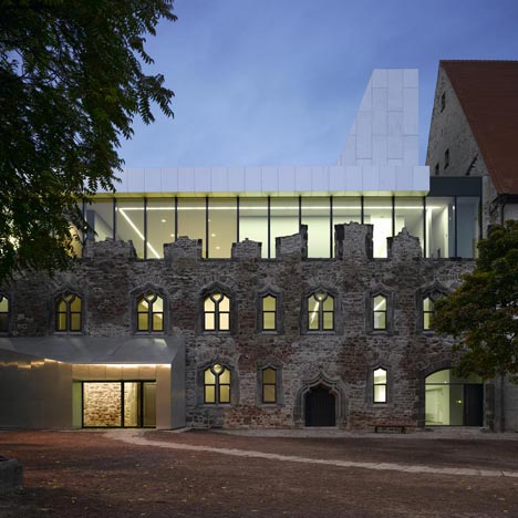
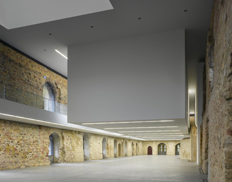
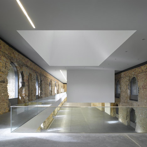
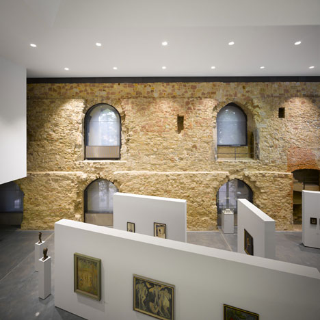
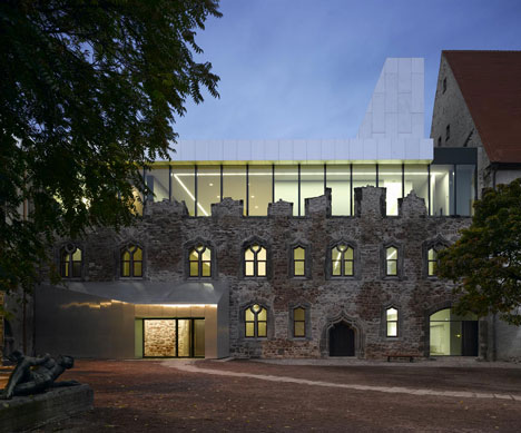
Photographer Roland Halbe has sent us these images of an extension to a museum inside a ruined castle in Halle, Germany, by Spanish studio Niento Sobejano Arquitectos.
Moritzburg Museum Extension by Niento Sobejano Arquitectos
The architects inserted the extension above the 15th century stonework of the Moritzburg Museum, providing a roof to the previously open-air top floor.
Moritzburg Museum Extension by Niento Sobejano Arquitectos
A new floor suspended from the centre of this roof creates an additional exhibition area without bringing any columns into the main gallery.
Moritzburg Museum Extension by Niento Sobejano Arquitectos
The extension also includes the addition of a trapezium-shaped metal entrance.
Moritzburg Museum Extension by Niento Sobejano Arquitectos
The following information is from the architects:

Moritzburg Museum Extension
Competition 1st Prize 2004
The ancient castle of Moritzburg in the city of Halle is a very valuable example of Gothic military architecture, typical of Germany at the end of the 15th century. Its turbulent history has inevitably been reflected in the many alternations it has undergone over the years. But despite these, the building still keeps the original structure of its main architectural features: the surrounding wall, three of the four round towers at the corners and the central courtyard.

Monday, June 13, 2011

Loft 24-7 - Sao Paulo, Brazil


Standing out in Abu Dhabi takes more than clever gimmicks. Among the opulence of luxury hotels, lavish restaurants and all other forms of pampering and spectacular entertainment – including Ferrari World and a few breathtaking golf clubs – being merely great is nowhere near enough.


The legendary Cipriani Group is one of the brave enterprises that has recently entered the competition for the attentions of the demanding super-elite clientele.

Cipriani’s nightclub, Allure, at the Yas Island Yacht Club on Yas Island, has a few features that warrant at least one extra bat of even the most worldly of eyelashes.


The night club’s location is one such feature. Allure overlooks the water and extravagant super yachts of the Yacht Club. It is also connected by a bridge to magnificent five-star The Yas Hotel. But the most amazing part of the nightclub is the view. What you see from its balcony is a real Formula One™ race track.


Designed by Orbit Design Studio (Bangkok, London and Singapore), Allure is divided into The Main room adorned with gold leaf and bronze cladding, and The Terrace that overlooks the race track.


Orbit has also designed the Sound Phuket night club we’ve featured, the Bed Supperclub in Bangkok, and many other luxury bars, clubs and restaurants designers throughout Asia, the Middle East and Europe. - Tuija Seipell
http://www.thecoolhunter.net/

Photography by Owen Raggett

Blog Archive