Monday, January 31, 2011

Oscar Niemeyer’s Refurbishment


Oscar-Niemeyer-s-Refurbishment1
This is Oscar Niemeyer’s Refurbishment, a masterpiece brought to life by the talented creators Felipe Hess and Renata Pedrosa.
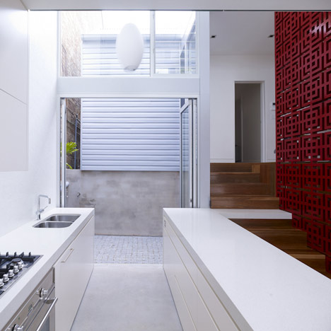
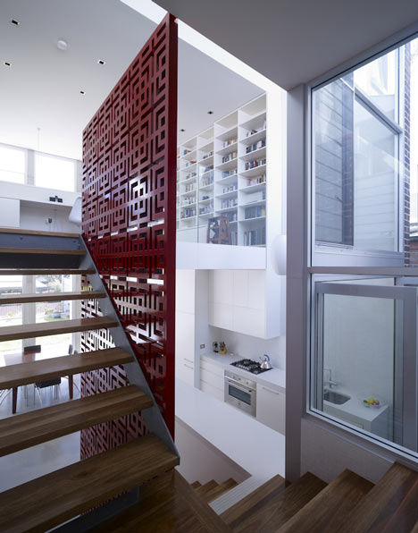
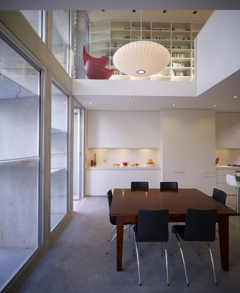
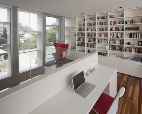
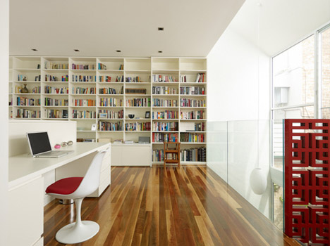
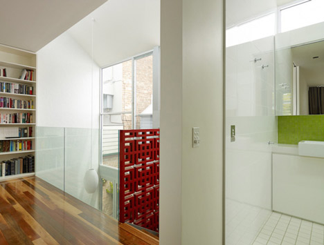
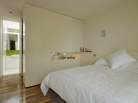
This project entailed the conversion of an original devised three bedroom interior into an open space contemporary loft. A loft with fluid circulation and grand social spaces with no permanent partitions. In order to achieve this openness the architects cleverly divided the private from the social spaces by the introduction of a central block dividing the two activities. Facing the private areas the block contains linen storage and closets, and on the other side looking at the social area it hosts shelving with memorabilia, a built in concrete bench and the absolute naked concrete kitchen.
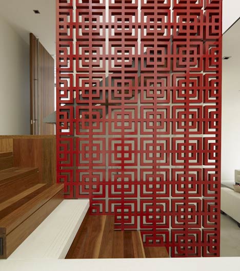
The overall design consists of what we call absolute sexiness. Raw exposed distressed concrete, exposed piping, stark white walls and ceiling protruding symmetry. In combination with these finishes lies the perfect merge with the introduction of wide floor boards and wooden shelving that introduce warmth and sensuality. This controlled order creates an interior which is the epitome of modern loft living with the ambience of contemporary living.
Oscar-Niemeyer-s-Refurbishment2
Oscar-Niemeyer-s-Refurbishment3
Oscar-Niemeyer-s-Refurbishment4
Oscar-Niemeyer-s-Refurbishment5
Oscar-Niemeyer-s-Refurbishment6
Oscar-Niemeyer-s-Refurbishment7

Friday, January 28, 2011

A Gentlemen’s Club Office


Pool tables, free beer and “casual everyday” dress code may have become the desired and appropriate work environment in many companies, but for some, a gentlemen’s club atmosphere works better.

London-based architecture and design firm SHH created this elegant office in London for an international investment company. The offices are located in a five-storey Georgian townhouse connected to a two-storey mews by a partially covered walkway. Several marble-inlaid fireplaces, marble mosaic floor tiles and beautiful ceiling cornices were kept from the previous occupants but the rest underwent a thorough modernization.


The resulting milieu is imposing and somewhat intimidating. Its dark, black-and-white photography vibe harkens back to some secret storied past, yet the contemporary treatments, especially the dramatic lighting pieces return the thoughts back to today.


Some of the light fixtures are by Modular and Foscarini and the statement chandeliers were custom-designed by Michael Anastassiades.

Custom-work, limited-edition pieces and classic furnishings such as Eames chairs accent each space, giving stunning jolts among the calm opulence.


Showing up in dated jeans or worn-out sneakers (unless you are Steve Jobs or Richard Branson) in this space would not seem appropriate, and should cue sports be allowed, they would most likely be the English Billiards variety.

Founded in 1992 by David Spence, Graham Harris and Neil Hogan (the S, H and H) of architecture and design firm SHH is now a practice of more than 50 people working globally on architecture, design and branding projects.


Many of SHH’s retail, hospitality, nightclub and office clients are in the luxury category, but their client list includes also names such as Sheraton, Adidas, Pizza Hut, Aphostrophe and McDonald’s. - Tuija Seipell
http://www.thecoolhunter.co.uk

A Kid's Castle


Back in my childhood, I guess my love for home and design was starting to become noticeable. I remember pretending to build a makeshift house by hanging sheets over the dining room table in order to create my own private refuge. It used to be my sanctuary where I would play with my favorite toys, and maybe, invite a couple of my closest friends. But how times have changed! After drooling over these incredible kiddie cottages, my make-do tent house is put to shame. These über cool and fun structures, by SmartPlayouse, are authentic designer pieces inspired by contemporary architecture. Don't I wish they had existed back then!
I'm sure any kid would die for any of these models. They're a perfect space that offers them a cozy place to play, develop their creativity and learn to share. Although most models are designed as outdoor houses, there are a couple that have a smaller version for inside. How cool is that? I can think of a few kids I know who would love to be the proud owners of one of these beauties.
Since these little mansions are made to order, you can customize them to your needs. The garden versions are made with high quality weather-resistant materials so they can be enjoyed for years. I'll be honest, as much as I would have wanted to own one of these little mansions, my tent-like structure served its purpose and made me very happy. It gave me a chance to expand my creativity. Besides, I would've probably driven my parents crazy wanting to buy furniture and accessories to decorate it. Don't you love them too? 

A Pad Of Many Folds


There is nothing traditional or predictable about this space. And that's exactly why I fell in love with it and had the urge to write about its incredible design. While looking for the genius behind the project, I was happy to find out it was G&R Studio, one of my favorite Spanish architectural firms. Hector Ruiz-Velazquez and Javier Garcia worked hand in hand to create this out-of-the-box conceptual space. As you come in, you're greeted by a white origami-like structure that starts turning like a piece of paper running through the whole 530 square feet. This wooden centerpiece is so cleverly designed that it leaves open the living spaces and gives the necessary privacy to the bedroom and bathroom. It also encases the staircase to the second floor where the bedroom is located.
The dramatic contrast between the stark walls and the black marble floors is what gives this place a futuristic look. Also, the use of white helps reflect the natural light coming in. The kitchen, although small, it's perfectly equipped with all the high-tech appliances needed to concoct a delish gourmet feast.
The “Inhabited Fold”, as the architects named this home, was a project commissioned by Whirpool to showcase some of their latest and most innovative home appliances in Casa Decor Barcelona. This can easily be a preview of what futuristic living can be. Let me tell I wouldn't have any problem living in a place like this. How about you?

Friday, January 14, 2011

Fusing History With Style

You would never expect to find this incredibly chic hotel behind the concrete façade of what used to be a Japanese Army headquarters building from the 1930s. Shanghai's Waterhouse at South Bund is a fierce boutique hotel located by the new Cool Docks development on the South Bund District. Neri & Hu Design based its entire design concept on "a blurring or an inversion of internal & external spaces, creating a disorienting yet refreshing spatial experience for guests in search of something out of the ordinary" — winning them an 'Emerging Architecture Award' by the Royal Institute of British Architects. 
It's incredible to see how the designers managed to transform a rather nondescript and utilitarian structure into such a magnificent retreat that fuses cutting-edge with comfort. It must be so neat to stay in a place where you can feel its history just by looking at the scars and cracks on the exposed walls.

Balmain House by Carter Williamson Architects

Balmain House by Carter Williamson Architects
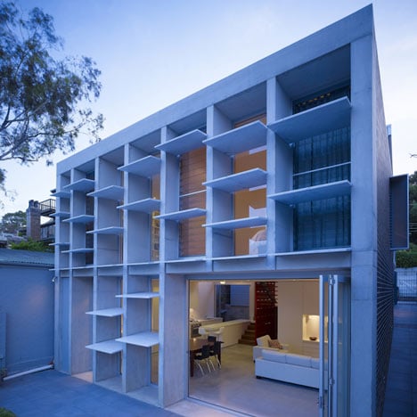
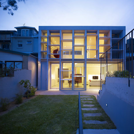
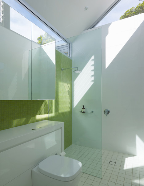
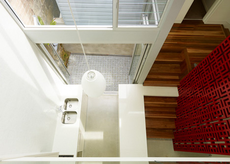
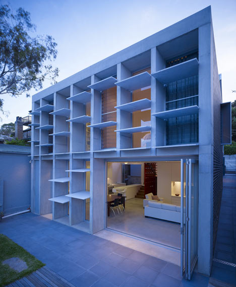
This extension to a family house with marble brise-soleils on the rear façade in New South Wales, Australia, is by Australian practice Carter Williamson Architects.
Balmain House by Carter Williamson Architects
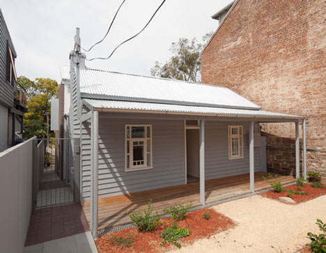
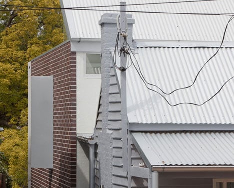
The house is a new addition to an existing timber cottage, which could not be removed from the site.
Balmain House by Carter Williamson Architects
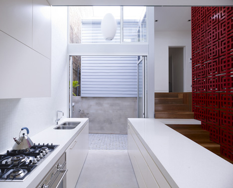
The original cottage sits in front of the new structure and is connected to it by a little covered courtyard area.
Balmain House by Carter Williamson Architects
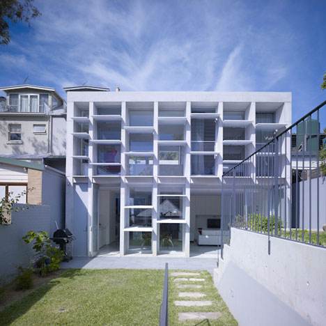
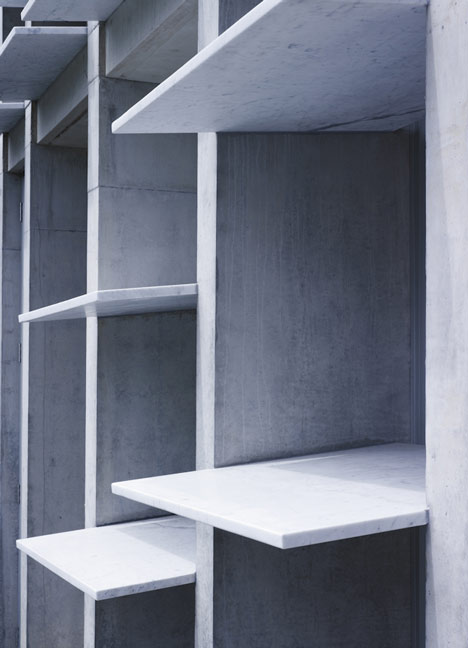
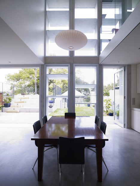
At the back of the house a concrete framework provides shading from the east and west, with horizontal marble slabs slotted in between.
Balmain House by Carter Williamson Architects
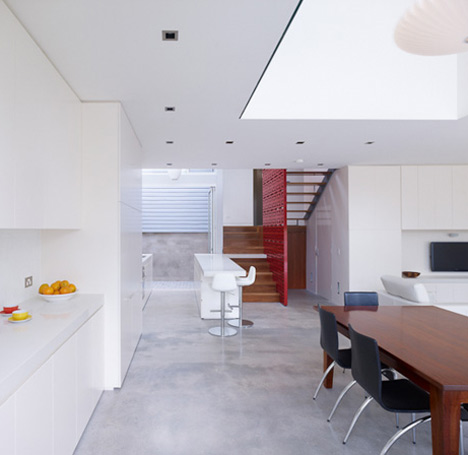
On the ground floor, a large tri-fold glazed door extends the open plan living space out to the garden.
Balmain House by Carter Williamson Architects
A bedroom, study, library and bathroom are located on the first floor.
Balmain House by Carter Williamson Architects
Photographs are by Brett Boardman.
Balmain House by Carter Williamson Architects
The following information is from the architects:

The brief was to bring light into our clients’ home and their lives.
Balmain House by Carter Williamson Architects
Their old home was Victorian, dark and periodically tight and depressing. It was little changed when we got it.
Balmain House by Carter Williamson Architects
The original house on the site is an 1860s timber cottage sourced, sawn and constructed from local timber.
Balmain House by Carter Williamson Architects
A L+EC ruling had virtually made it a heritage item, which came with court-defined planning concessions.
Balmain House by Carter Williamson Architects
The design is for a new building to sit sympathetically behind and recessive from the original cottage.
Balmain House by Carter Williamson Architects
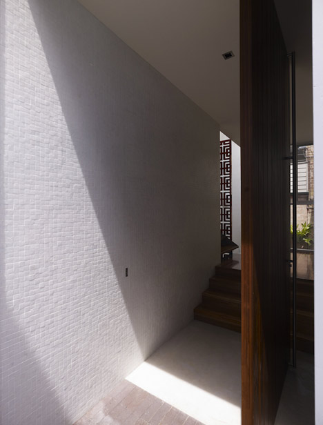
The new building touches the old through a light, small connection that locates a gothic-like courtyard and the front door.
Balmain House by Carter Williamson Architects
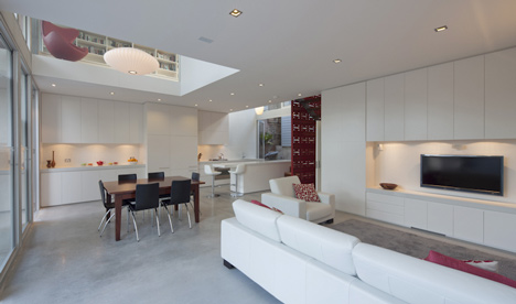
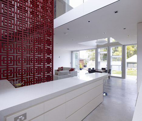
The square ground floor houses the kitchen, living and dining rooms.
Balmain House by Carter Williamson Architects
Large voids puncture the upper level plan, organising the space between bedroom, study and library.
Balmain House by Carter Williamson Architects
The voids spatially organise the ground plan defining the kitchen, dining and circulation.
Balmain House by Carter Williamson Architects
The rear facade is a composition of light and shade.
Balmain House by Carter Williamson Architects
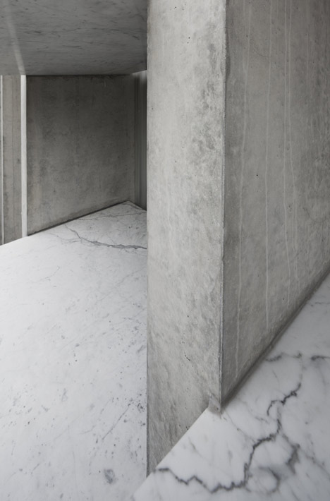
Strong off-form concrete blades attenuate east and west light, while marble horizontal louvres control northern light.
Balmain House by Carter Williamson Architects
The formal rhythm of the vertical blades are offset by the playfulness of the horizontal louvres.
Balmain House by Carter Williamson Architects
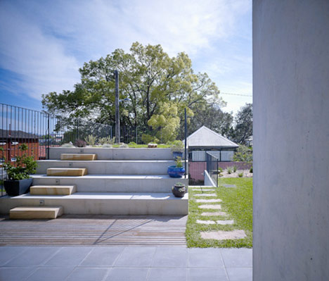
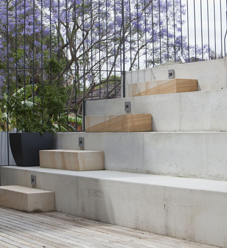
A roof garden hides the garage and defines an amphitheatre to the living room.
Balmain House by Carter Williamson Architects
Team Architect: Shaun Carter
Balmain House by Carter Williamson Architects
Designers: Patrick Fitzgerald, Mattia Fiumani
Balmain House by Carter Williamson Architects

Blog Archive